The Importance of IPEDS

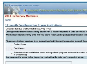
IPEDS FormThe IR responsibility of providing summary data to the federal government through the Integrated Postsecondary Education Data System (IPEDS) sounds like as much fun as completing tax forms.   And as a matter of fact that analogy pretty much captures it!   It’s an obligation of all institutions that participate in any kind of Title IV funding programs (federal student financial aid), which means that like death and taxes, it affects just about all of us.  Assembling and providing this information is not always easy, but it’s a responsibility that we take very seriously, and we do our best to work effectively with our colleagues internally so that we provide the most accurate data possible.

I recently attended a workshop to become a “trainer” for IPEDS.  The Association for Institutional Research (AIR) works with the National Center for Educational Statistics (NCES) to provide training and support for both submitting data and using the data that NCES makes available to the public.   It’s a really wonderful program of online tutorials, face-to-face workshops, and other activities that promote understanding of this important resource, and I’m excited about being involved.  I’ve always been a girl scout about this stuff anyway, but the workshop reinforced just how valuable and PUBLIC! a resource this is.  Once submitted (and after the agency’s review and consistency checking) this information becomes available to the public through the IPEDS Data Center.   That means that anyone can use it …and they do!   Policy analysts, legislators, reporters, grant agencies, prospective students, administrators at peer institutions, accreditors, job-seekers, higher education researchers, the list is endless.    The accuracy of data can reflect on individual institutions – you really don’t want to show up on the U.S. Department of Education’s list of institutions with the fastest increasing tuition because you couldn’t be bothered to double-check your numbers – but it also has implications for policy, research conclusions, and many other decisions that affect the higher education community.

Telling Stories

Storybooks on a shelfLast week I participated in a workshop sponsored jointly by the Center for Digital Storytelling (CDS) and Swarthmore College.  It was an intense three-day experience, in which about a dozen participants were taught the basics of constructing an effective narrative using images, music, and voice.   The folks from CDS (Andrea Spagat, Lisa Nelson-Haynes) were just wonderful – skilled, patient, experienced – as were our ITS staff members who supported the workshop (Doug Willens, Michael Jones, and Eric Behrens).

I had wanted to learn more about this technology to see if it might be a useful way for IR to share information with the community.  I can envision short, focused instructional vignettes, such as tips on constructing surveys, everyday assessment techniques, or even how to interpret a particular factbook table that is vexing.   (Generally, a table that requires instructions ought to be thrown out!)   We may try one of these and see how it goes.

I learned about the technology, but I also learned some amazing stories about my Swarthmore colleagues who participated with me.   These stories often reflect important personal experiences, which could have been difficult to share if it weren’t such a supportive environment.  An unexpected outcome of the workshop is that a group of colleagues all got to know each other a lot better!

Catching our breath…

A lynx resting
photo by Tambako the Jaguar

It’s hard to believe that this semester is finally drawing to a close.   The multitudes of followers to our blog may have noticed our sparse posts this spring…   Shifting responsibilities, timing of projects, and just the general “stuff” of IR have left us little time to keep up.

Part of my own busy-ness has been due to an increased focus on assessment, as mentioned in an earlier post.  This spring, the Associate Provost and I met with faculty members in each of our departments to talk about articulating goals and objectives for student learning.   In spite of our being there to discuss what could rightly be perceived as another burden, these were wonderful meetings in which the participants inevitably ended up discussing their values as educators and their concerns for their students’ experiences at Swarthmore and beyond.  In spite of the time it took to plan, attend, and follow-up on each of these meetings, it has been an inspiring few months.

Spring “reporting” is mostly finished.  Our IPEDS and other external reports are filed, our Factbook is printed, and our guidebook surveys have been completed (although we are now awaiting the “assessment and verification” rounds for US News).  Soon we will capture our “class file” –  data reflecting this year’s graduates and their degrees, and that closes the year for freezing and most of the basic reporting of institutional data.

We also are fielding two major surveys this spring, our biennial Senior Survey (my project) and a survey of Parents (Alex’s project).    Even though we are fortunate to work within a consortium that provides incredibly responsive technical support for survey administration, the projects still require a lot of preparation in the way of coordinating with others on campus, creating college-specific questions, preparing correspondence, creating population files, trouble-shooting, etc.  The Senior Survey is closed, and I will soon begin to prepare feedback reports to others on campus.   The Parents Survey is still live, and will keep Alex busy for quite some time.

As we turn to summer and the hope of having a quieter time in which to catch up, we anticipate focusing on our two projects that are faculty grant-funded.   We don’t normally work on faculty projects – only when they are closely related to institutional research.

We are finishing our last year of work with the Hughes Medical Institute (HHMI) grant.  IR supports the assessment of the peer mentor programs (focusing on the Biology and Mathematics and Statistics Departments) through analysis of institutional and program experience data, and surveys of student participants.   We will be processing the final year’s surveys, and then  I will be updating and finalizing a comprehensive report on these analyses that I prepared last summer.

Alex is IR’s point person for the multi-institutional Sloan-funded CUSTEMS project, which focuses on the success of underrepresented students in the sciences.  Not only does he provide our own data for the project, but he will be working with the project leadership on “special studies,” conducting multi-institutional analyses beyond routine reporting to address special research needs.

I wonder if three months from now I’ll be writing… “It’s hard to believe this busy summer is finally ending!”

Using Everyday Words in Surveys

One of the platitudes maxims I often repeat when I give advice or presentations on survey design goes something like this:

“If you think there are different ways of interpreting a question, chances are that someone will…”

Around the time that I repeat this I also do some carrying on about how even what seem to be the most everyday of words or terms can be interpreted in many different ways.  This morning I came across another example that can be added to my harangue on this topic.  It is from 2008 but it is new to me:

“When preparing our GSS survey questions on social and political polarization, one of our questions was, ‘How many people do you know who have a second home?’ This was supposed to help us measure social stratification by wealth–we figured people might know if their friends had a second home, even if they didn’t know the values of their friends’ assets. But we had a problem–a lot of the positive responses seemed to be coming from people who knew immigrants who had a home back in their original countries. Interesting, but not what we were trying to measure.”

–Andrew Gelman, source:

http://andrewgelman.com/2008/03/a_funny_survey/

I should also note that in the comments on this post Paul M. Banas mentioned “being more direct” and using the phrase “vacation home” instead.  This sounds like good advice to me.

Some Resources on Surveys

Here is a list of references and resources from my portion of today’s “Notes from the Field: Surveys with SwatSurvey” workshop sponsored by Information Technology Services.  My presentation is specifically focused on survey question wording and order.


Many of my examples came from these general sources:

Dillman, Don A. 2007. Mail and Internet Surveys: The Tailored Design Method, 2nd Edition.

Groves et al. 2004. Survey Methodology.

Other resources:

Fowler, Floyd. 1995. Improving Survey Questions: Design and Evaluation.

American Association for Public Opinion Research (http://www.aapor.org/)

  • Public Opinion Quarterly
  • Survey Practice
  • “AAPOR Report on Online Panels” – for a nice summary of the issues associated with opt-in web surveys.

Couper, M. P. 2008. Designing Effective Web Surveys.

Foddy, William. 1993. Constructing Questions for Interviews and Questionnaires.

Journals:

Survey Methodology

Survey Research Methods

International Journal of Market Research

Marketing Research

Journal of Official Statistics

Journals devoted to specific social science disciplines also occasionally have great pieces on survey research: 

Krosnick, Jon. 1999. “Survey Research.” Annual Review of Psychology, v. 50.

Autonomy and Assessment

Swarthmore presents an interesting mix of uniformity and decentralization.  As a residential, undergraduate liberal arts institution, it is easy to summarize.  Our size is small, and retention and graduation rates are very strong so that enrollment is very predictable from year to year (about 1500).  There are no graduate students.   Generating enrollment projections can be downright boring!   Standards are high for students coming in and going out.  Our faculty is heavily reliant on tenure lines.  There are no separate schools creating the silos that are so vexing to my counterparts trying to do institutional research at larger colleges and universities.

But due to a history and culture of very strong faculty governance, our departments are among the most autonomous that I’ve seen, even at very similar institutions.  The most important decisions are made with considerable input by and deference to the faculty, if not by the faculty itself.    On one hand that means that members of the administration are generally regarded in a collegial manner, and that once decisions are made, they are truly made.  On the other hand it can be a delicate matter to introduce change, especially change necessitated by external forces.  Though occasionally frustrating (and quite slow), I think this is generally an excellent thing.  (It does, however, take quite a toll on our faculty in terms of their workload.)

When Swarthmore, like most institutions, was first “dinged” by our accrediting agency for not doing enough formal assessment (2004), the initial response was understandable indignation.  Self-reflection and evaluation is what we do best.  We talk endlessly about what we do, how we do it, and how we could it better – in committees, in hallways, with our students, alumni, and each other.  I have never met anyone here who doesn’t care deeply about serving our students.

But upon gathering ourselves to address this concern, the faculty designated an ad hoc committee – comprised entirely of faculty.  This group considered the criticism, looked at what we do and what we might do better, and in 2006 recommended a plan.  This plan was discussed by the entire faculty, modified, and finally approved by the faculty, and stands as our foundational document for academic assessment.  It’s an elegant document.  They took a thoughtful and measured approach, included key elements and ideas that we’ll use and build on for years, and the best part is, the faculty owns it.

We are now at a stage of identifying places where we need to bolster our efforts in assessment.  My position has been modified so that I now report one third time to the Provost’s Office to work with faculty on this process.  It has been my privilege to participate in meetings with chairs in each division this past fall, and at those meetings I am struck again by the autonomy of our faculty, departments, and programs.  As an outsider, it is a little scary.  Though no one here is interested in creating a uniform approach or in any way dictating to departments what they should do for assessment, particular steps ought to be taken for the process to be meaningful, and I wonder how that will happen.  But then I remember what it is that the faculty are fiercely protecting – it’s not about turf, it’s about students and the experiences the department is providing them.   Since assessment is itself about student learning,  I have no doubts that the members of the faculty will make it work.

Gallery of Student Engagement Items

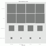
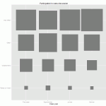
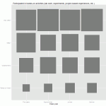
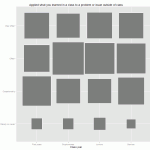
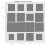
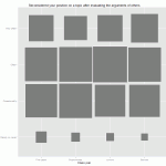
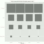
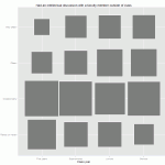
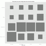
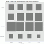
I finally had the chance to revisit an earlier post where I created a fluctuation plot for a recent survey item about the frequency of class discussion.  This item is a part of an array of items that asks about the frequency (using the familiar “Rarely or never-Occasionally-Often-Very often” scale) during the academic year of a variety of activities often associated with student engagement.  I created fluctuation plots for the whole set of items and put them into the photo gallery below.  Like the plot from the previous post, these show the percentage of responses by category, by class year.  Click anywhere on the gallery image below and you can use the arrows to flip through the items.  Instructions on how to create these in R can also be found in the earlier post.


The Chronicle’s Recent Take on Data Mining in Higher Ed

Photo by Andrew Coulter Enright

A recent article in The Chronicle of Higher Education titled, “A ‘Moneyball’ Approach to College” (or “Colleges Mine Data to Tailor Students’ Experience”)  presents some ways that data mining is being used in higher ed.  At the risk of sounding like someone overly zealous about enforcing the boundaries around obscure specializations, the article for the most part presents examples of mining instructional practice or the “Learning Analytics/Educational Data Mining” approach which is only a subset of the types of data mining or analytics being done in higher ed.  Examples par excellence of this approach to higher ed data mining can be seen in The International Educational Data Mining Society’s journal and presented at their meetings.

Instead of building Amazon.com-style recommendation engines for courses or analyzing blackboard “clickstreams,” many institutional researchers have been engaged in data mining to deal with some of the perennial questions like yield, enrollment, retention, and graduation – for quite some time.  For example, the professional journal New Directions for Institutional Research  published an entire issue in November 2006 dedicated to data mining in enrollment management.  One of the studies, conducted by Serge Herzog of University of Nevada, Reno, “Estimating Student Retention and Degree-Completion Time” found that data mining techniques such as decision trees and neural nets could be used to outperform tradition statistical inference techniques in predicting student success in certain circumstances.

The author of The Chronicle piece writes that “in education, college managers are doing something similar [to Moneyball] to forecast student success—in admissions, advising, teaching, and more”.  This is true, but it has been going on for a long time and in many more ways than just learning analytics and course recommendation systems.  I guess these institutional researchers who have always done data mining were Moneyball before it was cool.  Does that make them hipsters?

Presently Presenting

Present wrapped in red ribbonIn preparing to make a presentation at Swarthmore’s Staff Development Week next month, I thought it would be a good time to review some rules of thumb for making presentations that I’ve learned and discovered over the years.  Because institutional researchers generally have such a range of people in our audiences, it can be tricky!

Power Point – This package is both a curse and a blessing.  As a presenter I like having a visual reminder of key points, and to help frame for the audience where I’m going.  As an audience member I know too well that slides full of text are deadly boring.  Because I am a tactile learner, I have found that I like to organize my presentation by making a text-rich Power Point slide show, but then not actually showing much of it!  The advantage is that I can share the full document later as the version that “includes speaker notes.”  For the actual presentation, I try to use slides primarily for simple charts, illustrations, examples, and a minimal number of bullet points (with minimal associated text).   I want people to engage with what I’m saying, not read ahead.

Tell what you’re going to tell   – The importance of giving your audience a simple outline of the presentation was impressed on me by Alex.   After a particularly boring talk we’d attended, he persuaded me how much better it could have been if we’d simply been able to follow its logic, which an outline would have provided.

Tables – Avoid all but the simplest tables of data in a presentation, and make sure, if you want them to be read, that they are indeed legible from the back of the room.  If I am showing a table primarily to present a layout, I would make clear as soon as the slide is shown that it is not meant to be read.  (This is not uncommon for Institutional Researchers, who share strategies and techniques – sometimes it’s not the data we want to see, but how you presented it!)

Graphs – I personally love a graph that contains a ton of information on one page.  I could stare at it for hours, like someone else might stare at a painting and glean layers of meaning.  Alas, I would try not to make such a graph for others!  In general, the wider the audience, the simpler the chart should be.  Avoid ratios, or even percentages that aren’t immediately grasped.   And be sure to use colors.   A simple, attractive chart that reveals an important relationship can reveal meaning to even the most staunchly anti-data.

Involvement – Whenever possible, I try to involve the audience either through humor (but DON’T overdo it – I’m an institutional researcher rather than a comedian for a very good reason) or engaging with an exercise or activity.  At a faculty lunch presentation a number of years ago, before I began (during lunch), I left displayed a chart reflecting faculty opinions about their adequacy of sleep by career stage.  It certainly piqued interest – people love to hear about themselves!

Certainly none of this is new, but I find it helpful to review and remind myself of them before starting a new project.  As I look back through some of my past presentations I see that I haven’t always followed my own rules as well as I’d wish!   But presentations can be a powerful tool for accomplishing a primary goal of Institutional Research:  getting information to people who need it. And so it’s something I continue to try to learn about and work on.