Jason Bryer, a fellow IR-er at Excelsior College has a nice post (link) about techniques for visualizing Likert-type items – those “Strongly disagree…Strongly agree” items only found on surveys. He has even been developing an R software package called irutils that bundles these visualization functions together with some other tools sure to be handy for anyone working with higher ed data.
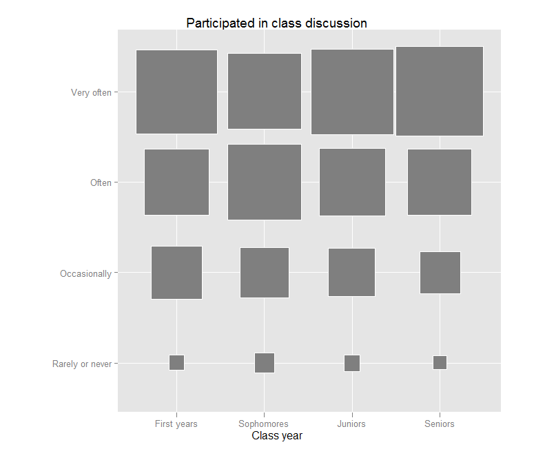
Jason’s post reminded me that I have been meaning to try out a “fluctuation plot” to visualize some recent survey results. A fluctuation plot, despite the flashy name, simply creates a representation of tabular data where rectangles are drawn proportional to the sizes of the cells of the table. The plot below has responses to a question about how often students here participate in class discussion along the left side and class year along the bottom. The idea behind this is to have a quick and very intuitive way to visualize how this item differs (or doesn’t differ) by class year. In this case, it looks like fewer of our sophomores (as a percentage) report participating in class discussion “very often” than their counterparts. This may suggest a need for further research. For example, are there differences in the kinds of courses (seminar vs. lecture) taken by sophomores?
Creating the plot
The plot itself requires only one line of code in R. If you are not a syntax person, I recommend massaging the data as much as possible in a spreadsheet first. You can take advantage of a default setting in R where text strings are converted to “factors” automatically. This default functionality usually annoys the daylights out of R programmers, but in this case, it is actually exactly what you want.
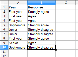
All you need to do is set up your data like this:
 Then you can save the file as a .csv and import it into R using my preferred method – the lazy method:
mydata<-read.csv(file.choose())
Nesting file.choose() inside of the read.csv() function brings up a GUI file chooser and you can just select your .csv file that way without having to fiddle with pathnames.
Once you’ve done this, you just need to load (or install then load) the ggplot2 package and you can plot away like this:
ggfluctuation(table(mydata$Response, mydata$Year))
You can add a title, axis labels, and get rid of the ugly default legend by adding some options:
ggfluctuation(table(mydata$Response, mydata$Year)) + opts(title=”Participated in class discussion”, legend.position=”none”) + xlab(“Class year”) + ylab(“”)
Once you’ve done that, you’ll have just enough time left to prepare yourself for the holiday cycle of overeating-napping in front of the TV-overeating some more. My family will be having our traditional feast of turkey AND lasagna. If your life so far has been deprived of this combination, I suggest seeking out someone of Southern Italian heritage and inviting yourself over for dinner. But be warned – you may be required to listen to Mario Lanza records during the meal.
Happy Thanksgiving!
