[click to enlarge]
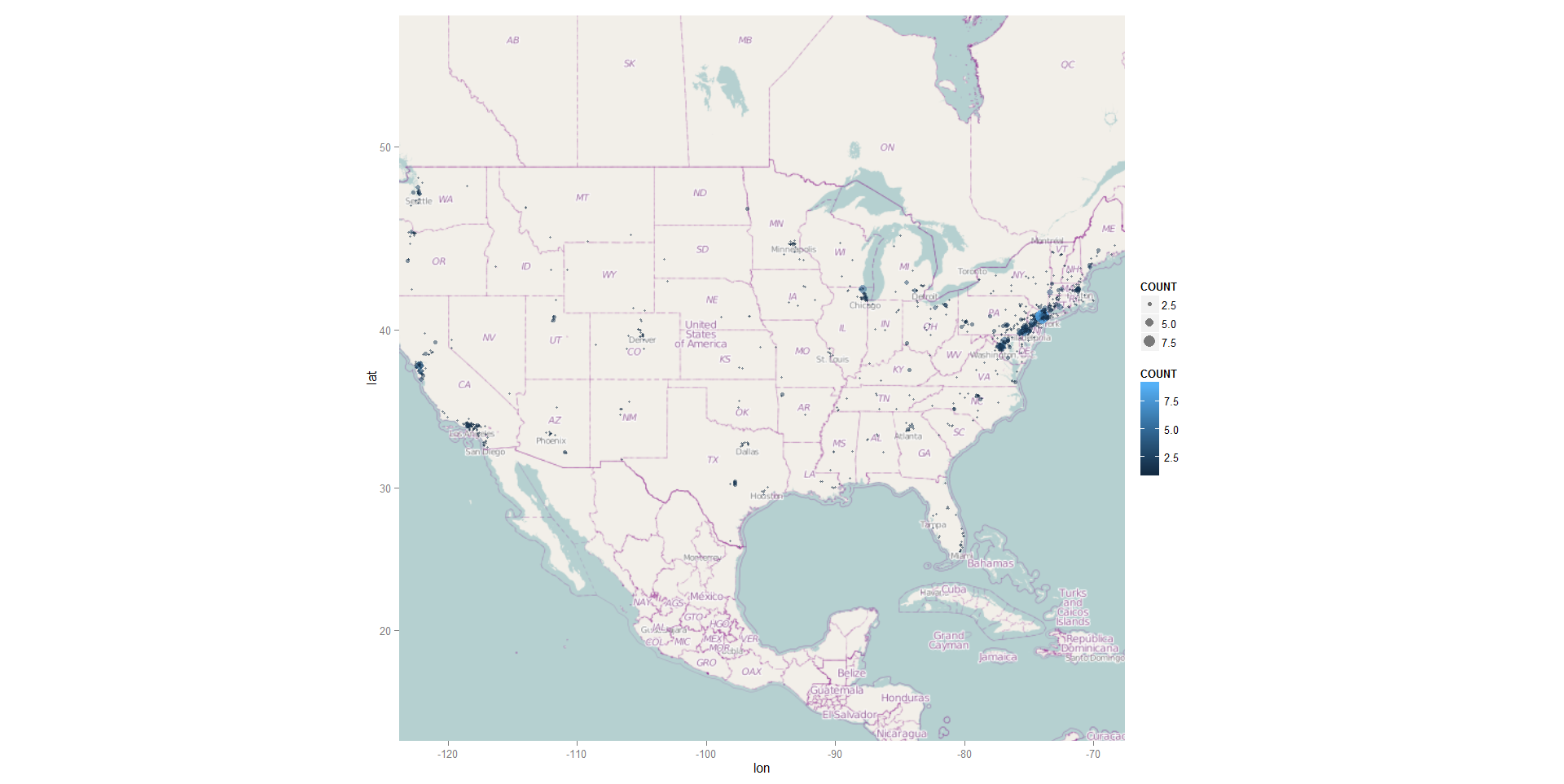
I’ve recently been playing around with the ggmap package in R and was able to quickly put together a bubble chart version of student home zip codes. As you can see from the two legends, the size and color both reflect the number of students in these zip codes.
I will certainly be playing around with ggmaps so more as this map required only two lines of code (after the ggmap library was loaded).
R CODE:
usmap<-qmap(‘united states’, zoom=4, source=’osm’,extent=’panel’)
usmap+geom_point(aes(x=X, y=Y, size=COUNT, color=COUNT), data=DATA, alpha=.5)
HAPPY HOLIDAYS!
