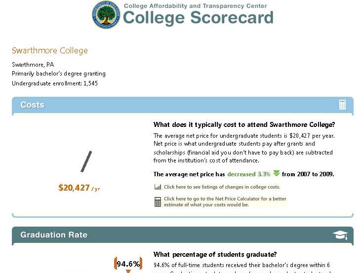
 President Obama announced the new “College Scorecard” in his state of the union address, and the interactive online tool was released the next day. The intended purpose of the tool is to provide useful information to families about affordability and student success at individual colleges. Since then, the IR community has been buzzing. Much of the data in the tool is reported via the IR offices, and many of us are already being asked to explain the data and the way it is presented. Several of our listservs became quite busy as my colleagues compared notes on glitches in the lookup feature of the tool (zip codes searches were problematic early on) and the accuracy of the data, and debated the clarity of the labels and the wisdom of the simple presentation.
This project is an example of a wonderful goal that is incredibly hard to execute well. Seeing all the press coverage (both mainstream and higher ed press) and hearing from my colleagues, I think about the balance of such a project. It seems reasonable that after thorough development and testing, there would be a point at which the best course of action is to just move forward and release it even though it is not perfect. But where is that point? One could argue whether this was the correct point for the Scorecard project, but all of the attention is creating increased awareness by the public, as well as pressures on the designers for improvement, and on colleges for accuracy and accountability.

I wonder how many people remember the clunky online tool, COOL (the College Opportunities On Line), from the early 00’s, and the growing pains that it went through as it evolved into the College Navigator, a pretty spiffy – and very useful – tool for families to find a wealth of information about colleges? These things evolve and if not useful and effective, won’t survive. The trick is not doing more harm than good while the kinks are worked out.
What’s in the Scorecard and where did it come from? The Scorecard has six categories of information: Undergraduate Enrollment, Costs, Graduation Rates, Loan Default Rate, Median Borrowing, and Employment. Information about the data and its sources can be found at the Scorecard website, but it takes a little work! Click on the far right square that says “About the Scorecard” on the middle row of squares. From the text that spins up, click “Here”, which opens another window (not sure if these are “pop-ups” or “floating frames”), and that’s where the descriptions are.
The data for the first three items come from our reporting to the federal government through the IPEDS (Integrated Postsecondary Education Data System), which I have posted about before. Here is yet another reason to make sure we report accurately! The next two categories, Loan Default Rate and Median Borrowing, get their data from federal reporting through the National Student Loan Data System (NSLDS). The last item, Employment, provides no actual data, but rather a sly nudge for users of the system to contact the institutions directly.
While each of these measures creates its own challenge to simplicity and clarity of explanation, one of the more confusing, and hence controversial, measures is the “Cost.” The display says “Net price is what undergraduate students pay after grants and scholarships (financial aid you don’t have to pay back) are subtracted from the institution’s cost of attendance.” This is an important concept, and we all want students to understand why they should not just look at the “sticker price” of a college, but at what students actually pay after accounting for aid. Some very expensive private colleges can actually cost less than public institutions once aid is factored in, and this is a very difficult message to get out! But the more precise definition behind the scenes (that floating frame!) says “the average yearly price actually charged to first-time, full-time undergraduate students receiving student aid at an institution of higher education after deducting such aid.” The first point of confusion is that this net price is calculated only for first-time, full-time, aided students, rather than averaged across all students. The second is the actual formula, which takes some more digging. It uses the “cost of attendance,” which is tuition, fees, room, and board, PLUS a standard estimate of the cost for books, supplies, and other expenses. The aid dollars include Pell grants, other federal grants, state or local government grants (including tuition waivers), and institutional grants (scholarship aid that is not repaid). And the third point that may cause confusion is, of course, the final, single figure itself which is an average, while no one is average.
Will a family dig that deep? Would they understand the terminology and nuances if they did? Would they be able to guess whether their student would be an aid recipient, and if so, whether they’d be like the average aid recipient? The net price presentation that already exists in the College Navigator has an advantage over the single figure shown in the Scorecard, because it shows the value for each of a number of income ranges. While aid determinations are based on much more than simple income, at least this presentation more clearly demonstrates that the net price for individuals varies – by a lot!


