National Student Clearinghouse: Degree Title Categories

I enjoy working with National Student Clearinghouse (NSC) return data, but the differences between the way schools report Degree Titles can be frustrating.  For example, here’s just a few of the ways “juris doctor” can appear:

a few ways JD can appear

I’ve worked on a few projects where it was necessary to work with the type of degree that was earned.  For example, as part of Access & Affordability discussions, it was important to examine the additional degrees that Swarthmore graduates earned after their Swarthmore graduation by student need level to determine if graduates in any particular need categories were earning certain degrees at higher/lower rates than other need categories.

example data_degree cat by need cat


In order to do this, I first had to recode degree titles into degree categories.

The NSC does make available some crosswalks, which can be found at https://nscresearchcenter.org/workingwithourdata/

The Credential_Level_Lookup_table can be useful for some projects.  However, my particular project required more detail than provided in the table (for example, Juris Doctors are listed as “Doctoral-Professional” and I needed to be able to separate out this degree), so I created my own syntax.

I’m sharing this syntax (below) as a starting point for your own projects. This is not a comprehensive list of every single degree title that has been submitted to the NSC, so be careful to always check to see what you need to add to the syntax.

While I have found this to be rarer, there are the occasional degrees that come through without a title in any of the records for that degree.  I’ve therefore also included a bit of syntax at the top that codes those with a Graduated=”Y” but a blank Degree Title to “unknown.”  If you are choosing to work with those records differently, you can comment out that syntax.

Once you have created your new degree categories variable(s), you can select one record per person and run against your institutional data.  One option is to keep, for those who have graduated, the highest degree earned.  You can use “Identify Duplicate Cases” to Define Matching Cases by ID and then Sort Within Matching Groups by  DegreeTitleCatShort (or any other degree title category variable you’ve created).  Be sure to select Ascending or Descending based on your project and whether you want the First or Last record in each group to be Primary.

Hope this helps you in your NSC projects!

SPSS syntax:  Degree Title Syntax to share v3

Video and SPSS Syntax: Deleting Select Cases Using the National Student Clearinghouse Individual Detail Return File

There may be some situations where you would want to delete select records from an individual return file. For example, you may have a project where you are looking at student enrollment after graduation or transfer, and it is decided that your particular project will only include records for which a student was enrolled for more than 30 days in a fall/spring term or more than 10 days in a summer term. Or, you may have six years of records for a particular cohort, but you only want to examine records for four years. In both of these cases, you would want to delete the records that don’t fit your criteria before analyzing your data.

Continue reading Video and SPSS Syntax: Deleting Select Cases Using the National Student Clearinghouse Individual Detail Return File

Video and SPSS Syntax: Admit/Not Enroll Project Using the National Student Clearinghouse Individual Detail Return File

Irish United Nations Veterans Association house and memorial garden (Arbour Hill)” by Infomatique is licensed under CC BY-SA 2.0

I use the National Student Clearinghouse individual detail return file and SPSS syntax in this video to capture the first school attended for students who were admitted to my institution, but who did not enroll (names listed are not real applicants). In a future video, I’ll work on the same project using the aggregate report. I almost always use the individual detail return file since it provides so much information, but it does have a limitation that impacts this project.

Continue reading Video and SPSS Syntax: Admit/Not Enroll Project Using the National Student Clearinghouse Individual Detail Return File

Rules and Regs

The College has just submitted its Periodic Review Report (or PRR) to the Middle States Commission on Higher Education, our accrediting agency.   The PRR is an “interim” report, provided at the midpoint between our decennial self-studies.    Though it is not quite the bustle of a self-study – e.g. the bulk of the work is accomplished by one committee that works with others across campus, rather than a multitude of committees; there is no on-site visit from a team of examiners – it is an important accreditation event that takes a great deal of time and work to prepare. Continue reading Rules and Regs

Numbers, numbers…

Most IR people are fascinated with numbers, logic, probability, and statistics, which is part of what draws us to our field.   We like to poke at data, and think about what they can and cannot tell us about the phenomena they reflect.  It’s not surprising that many in the profession think that Nate Silver is somewhat of a god.   And so when one of our favorite numbers guru addresses a topic in higher education, our day is made!

Yesterday in his blog, Five Thirty Eight, Nate Silver talked about what the changing numbers of college majors do and do not tell us about college programs and whether or not some majors are suffering from an increased emphasis on career-focused programs.  He uses data from the National Center for Education Statistics – data provided by Institutional Researchers through our IPEDS reporting – and employs a standard IR approach in offering alternative perspectives on numbers:  using a different denominator.   No spoilers here, I couldn’t possibly do it justice anyway.   Please go read.

As an added bonus, Silver mentions his own undergraduate experience at the University of Chicago and advocates broad, diverse studies.   He didn’t explicitly mention “liberal arts education,” but at least a few of his readers’ comments do.   Oh well, you can’t have everything!

Keeping Score

SwatScoreSmPresident Obama announced the new “College Scorecard” in his state of the union address, and the interactive online tool was released the next day.  The intended purpose of the tool is to provide useful information to families about affordability and student success at individual colleges.  Since then, the IR community has been buzzing.   Much of the data in the tool is reported via the IR offices, and many of us are already being asked to explain the data and the way it is presented.  Several of our listservs became quite busy as my colleagues compared notes on glitches in the lookup feature of the tool (zip codes searches were problematic early on) and the accuracy of the data, and debated the clarity of the labels and the wisdom of the simple presentation.

This project is an example of a wonderful goal that is incredibly hard to execute well.   Seeing all the press coverage (both mainstream and higher ed press) and hearing from my colleagues, I think about the balance of such a project.   It seems reasonable that after thorough development and testing, there would be a point at which the best course of action is to just move forward and release it even though it is not perfect.   But where is that point?  One could argue whether this was the correct point for the Scorecard project, but all of the attention is creating increased awareness by the public, as well as pressures on the designers for improvement, and on colleges for accuracy and accountability.

HarmGoodSmall

I wonder how many people remember the clunky online tool, COOL (the College Opportunities On Line), from the early 00’s, and the growing pains that it went through as it evolved into the College Navigator, a pretty spiffy – and very useful – tool for families to find a wealth of information about colleges?   These things evolve and if not useful and effective, won’t survive.   The trick is not doing more harm than good while the kinks are worked out.

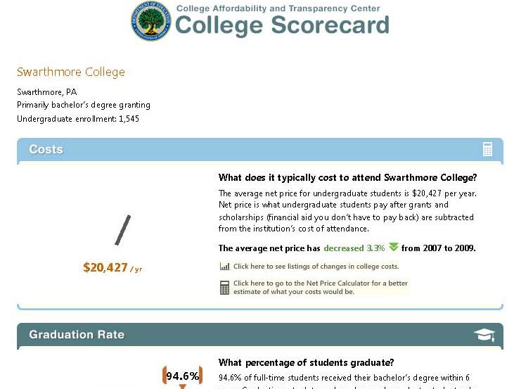
What’s in the Scorecard and where did it come from?   The Scorecard has six categories of information:  Undergraduate Enrollment, Costs, Graduation Rates, Loan Default Rate, Median Borrowing, and Employment.   Information about the data and its sources can be found at the Scorecard website, but it takes a little work!   Click on the far right square that says “About the Scorecard” on the middle row of squares.  From the text that spins up, click “Here”, which opens another window (not sure if these are “pop-ups” or “floating frames”), and that’s where the descriptions are.

The data for the first three items come from our reporting to the federal government through the IPEDS (Integrated Postsecondary Education Data System), which I have posted about before.   Here is yet another reason to make sure we report accurately!  The next two categories, Loan Default Rate and Median Borrowing, get their data from federal reporting through the National Student Loan Data System (NSLDS).   The last item, Employment, provides no actual data, but rather a sly nudge for users of the system to contact the institutions directly.

While each of these measures creates its own challenge to simplicity and clarity of explanation, one of the more confusing, and hence controversial, measures is the “Cost.”   The display says “Net price is what undergraduate students pay after grants and scholarships (financial aid you don’t have to pay back) are subtracted from the institution’s cost of attendance.”  This is an important concept, and we all want students to understand why they should not just look at the “sticker price” of a college, but at what students actually pay after accounting for aid.   Some very expensive private colleges can actually cost less than public institutions once aid is factored in, and this is a very difficult message to get out!  But the more precise definition behind the scenes (that floating frame!) says “the average yearly price actually charged to first-time, full-time undergraduate students receiving student aid at an institution of higher education after deducting such aid.”  The first point of confusion is that this net price is calculated only for first-time, full-time, aided students, rather than averaged across all students.   The second is the actual formula, which takes some more digging.   It uses the “cost of attendance,” which is tuition, fees, room, and board, PLUS a standard estimate of the cost for books, supplies, and other expenses.   The aid dollars include Pell grants, other federal grants, state or local government grants (including tuition waivers), and institutional grants (scholarship aid that is not repaid).   And the third point that may cause confusion is, of course, the final, single figure itself which is an average, while no one is average.

Will a family dig that deep?   Would they understand the terminology and nuances if they did?   Would they be able to guess whether their student would be an aid recipient, and if so, whether they’d be like the average aid recipient?   The net price presentation that already exists in the College Navigator has an advantage over the single figure shown in the Scorecard, because it shows the value for each of a number of income ranges.   While aid determinations are based on much more than simple income, at least this presentation more clearly demonstrates that the net price for individuals varies – by a lot!

“Optimal” Faculty to Staff Ratio

An article in the Chronicle today reports on a study by two economists about the optimal faculty to staff ratio.  The study is focused on Research 1 and 2 public institutions, but I couldn’t stop myself from applying the simple math formula to a small liberal arts college, such as Swarthmore, to see what would happen.

We are actually freezing our employee data today, and so I don’t yet have current numbers, but based on last year’s data we had 944 employees – 699 full-time.  The study identifies the optimal ratio as 3 tenure-tack faculty to each full-time professional administrator.  Using IPEDS reporting definitions, we had 162 tenured and on-track faculty members last year, and 242 full-time professional administrators (Executive/ Administrative/ Managerial, and Other Professional).   That’s a conservative estimate of “professional administrators,” because it’s unclear to me from the paper which categories are included in the final equation.   All non-faculty staff are considered at different points in their modeling.

So if that 3 to 1 ratio were desirable here, we would need to add 564 tenure-track faculty.   I don’t know how the 242 administrators would manage all the new buildings and infrastructure we’d need.   And our student to faculty ratio would drop to about 2:1.   Alternately, we could get rid of about 188 professional administrators to drop their total to 54.   In that case our 162 faculty would have to start managing housing, administering grants, raising funds, supporting IT, doing IPEDS reporting, etc., in addition to all their regular responsibilities.  I’m sure they’d enjoy that.

Guess I’ll just have to wait until these researchers tackle this issue for liberal arts colleges.

The Importance of IPEDS

IPEDS FormThe IR responsibility of providing summary data to the federal government through the Integrated Postsecondary Education Data System (IPEDS) sounds like as much fun as completing tax forms.   And as a matter of fact that analogy pretty much captures it!   It’s an obligation of all institutions that participate in any kind of Title IV funding programs (federal student financial aid), which means that like death and taxes, it affects just about all of us.  Assembling and providing this information is not always easy, but it’s a responsibility that we take very seriously, and we do our best to work effectively with our colleagues internally so that we provide the most accurate data possible.

I recently attended a workshop to become a “trainer” for IPEDS.  The Association for Institutional Research (AIR) works with the National Center for Educational Statistics (NCES) to provide training and support for both submitting data and using the data that NCES makes available to the public.   It’s a really wonderful program of online tutorials, face-to-face workshops, and other activities that promote understanding of this important resource, and I’m excited about being involved.  I’ve always been a girl scout about this stuff anyway, but the workshop reinforced just how valuable and PUBLIC! a resource this is.  Once submitted (and after the agency’s review and consistency checking) this information becomes available to the public through the IPEDS Data Center.   That means that anyone can use it …and they do!   Policy analysts, legislators, reporters, grant agencies, prospective students, administrators at peer institutions, accreditors, job-seekers, higher education researchers, the list is endless.    The accuracy of data can reflect on individual institutions – you really don’t want to show up on the U.S. Department of Education’s list of institutions with the fastest increasing tuition because you couldn’t be bothered to double-check your numbers – but it also has implications for policy, research conclusions, and many other decisions that affect the higher education community.

Autonomy and Assessment

Swarthmore presents an interesting mix of uniformity and decentralization.  As a residential, undergraduate liberal arts institution, it is easy to summarize.  Our size is small, and retention and graduation rates are very strong so that enrollment is very predictable from year to year (about 1500).  There are no graduate students.   Generating enrollment projections can be downright boring!   Standards are high for students coming in and going out.  Our faculty is heavily reliant on tenure lines.  There are no separate schools creating the silos that are so vexing to my counterparts trying to do institutional research at larger colleges and universities.

But due to a history and culture of very strong faculty governance, our departments are among the most autonomous that I’ve seen, even at very similar institutions.  The most important decisions are made with considerable input by and deference to the faculty, if not by the faculty itself.    On one hand that means that members of the administration are generally regarded in a collegial manner, and that once decisions are made, they are truly made.  On the other hand it can be a delicate matter to introduce change, especially change necessitated by external forces.  Though occasionally frustrating (and quite slow), I think this is generally an excellent thing.  (It does, however, take quite a toll on our faculty in terms of their workload.)

When Swarthmore, like most institutions, was first “dinged” by our accrediting agency for not doing enough formal assessment (2004), the initial response was understandable indignation.  Self-reflection and evaluation is what we do best.  We talk endlessly about what we do, how we do it, and how we could it better – in committees, in hallways, with our students, alumni, and each other.  I have never met anyone here who doesn’t care deeply about serving our students.

But upon gathering ourselves to address this concern, the faculty designated an ad hoc committee – comprised entirely of faculty.  This group considered the criticism, looked at what we do and what we might do better, and in 2006 recommended a plan.  This plan was discussed by the entire faculty, modified, and finally approved by the faculty, and stands as our foundational document for academic assessment.  It’s an elegant document.  They took a thoughtful and measured approach, included key elements and ideas that we’ll use and build on for years, and the best part is, the faculty owns it.

We are now at a stage of identifying places where we need to bolster our efforts in assessment.  My position has been modified so that I now report one third time to the Provost’s Office to work with faculty on this process.  It has been my privilege to participate in meetings with chairs in each division this past fall, and at those meetings I am struck again by the autonomy of our faculty, departments, and programs.  As an outsider, it is a little scary.  Though no one here is interested in creating a uniform approach or in any way dictating to departments what they should do for assessment, particular steps ought to be taken for the process to be meaningful, and I wonder how that will happen.  But then I remember what it is that the faculty are fiercely protecting – it’s not about turf, it’s about students and the experiences the department is providing them.   Since assessment is itself about student learning,  I have no doubts that the members of the faculty will make it work.

The Chronicle’s Recent Take on Data Mining in Higher Ed

Photo by Andrew Coulter Enright

A recent article in The Chronicle of Higher Education titled, “A ‘Moneyball’ Approach to College” (or “Colleges Mine Data to Tailor Students’ Experience”)  presents some ways that data mining is being used in higher ed.  At the risk of sounding like someone overly zealous about enforcing the boundaries around obscure specializations, the article for the most part presents examples of mining instructional practice or the “Learning Analytics/Educational Data Mining” approach which is only a subset of the types of data mining or analytics being done in higher ed.  Examples par excellence of this approach to higher ed data mining can be seen in The International Educational Data Mining Society’s journal and presented at their meetings.

Instead of building Amazon.com-style recommendation engines for courses or analyzing blackboard “clickstreams,” many institutional researchers have been engaged in data mining to deal with some of the perennial questions like yield, enrollment, retention, and graduation – for quite some time.  For example, the professional journal New Directions for Institutional Research  published an entire issue in November 2006 dedicated to data mining in enrollment management.  One of the studies, conducted by Serge Herzog of University of Nevada, Reno, “Estimating Student Retention and Degree-Completion Time” found that data mining techniques such as decision trees and neural nets could be used to outperform tradition statistical inference techniques in predicting student success in certain circumstances.

The author of The Chronicle piece writes that “in education, college managers are doing something similar [to Moneyball] to forecast student success—in admissions, advising, teaching, and more”.  This is true, but it has been going on for a long time and in many more ways than just learning analytics and course recommendation systems.  I guess these institutional researchers who have always done data mining were Moneyball before it was cool.  Does that make them hipsters?