Fast zip code map

[click to enlarge]

I’ve recently been playing around with the ggmap package in R and was able to quickly put together a bubble chart version of student home zip codes.  As you can see from the two legends, the size and color both reflect the number of students in these zip codes.

I will certainly be playing around with ggmaps so more as this map required only two lines of code (after the ggmap library was loaded).

R CODE:

usmap<-qmap(‘united states’, zoom=4, source=’osm’,extent=’panel’)

usmap+geom_point(aes(x=X, y=Y, size=COUNT, color=COUNT), data=DATA, alpha=.5)

HAPPY HOLIDAYS!

Using Everyday Words in Surveys

One of the platitudes maxims I often repeat when I give advice or presentations on survey design goes something like this:

“If you think there are different ways of interpreting a question, chances are that someone will…”

Around the time that I repeat this I also do some carrying on about how even what seem to be the most everyday of words or terms can be interpreted in many different ways.  This morning I came across another example that can be added to my harangue on this topic.  It is from 2008 but it is new to me:

“When preparing our GSS survey questions on social and political polarization, one of our questions was, ‘How many people do you know who have a second home?’ This was supposed to help us measure social stratification by wealth–we figured people might know if their friends had a second home, even if they didn’t know the values of their friends’ assets. But we had a problem–a lot of the positive responses seemed to be coming from people who knew immigrants who had a home back in their original countries. Interesting, but not what we were trying to measure.”

–Andrew Gelman, source:

http://andrewgelman.com/2008/03/a_funny_survey/

I should also note that in the comments on this post Paul M. Banas mentioned “being more direct” and using the phrase “vacation home” instead.  This sounds like good advice to me.

Some Resources on Surveys

Here is a list of references and resources from my portion of today’s “Notes from the Field: Surveys with SwatSurvey” workshop sponsored by Information Technology Services.  My presentation is specifically focused on survey question wording and order.


Many of my examples came from these general sources:

Dillman, Don A. 2007. Mail and Internet Surveys: The Tailored Design Method, 2nd Edition.

Groves et al. 2004. Survey Methodology.

Other resources:

Fowler, Floyd. 1995. Improving Survey Questions: Design and Evaluation.

American Association for Public Opinion Research (http://www.aapor.org/)

  • Public Opinion Quarterly
  • Survey Practice
  • “AAPOR Report on Online Panels” – for a nice summary of the issues associated with opt-in web surveys.

Couper, M. P. 2008. Designing Effective Web Surveys.

Foddy, William. 1993. Constructing Questions for Interviews and Questionnaires.

Journals:

Survey Methodology

Survey Research Methods

International Journal of Market Research

Marketing Research

Journal of Official Statistics

Journals devoted to specific social science disciplines also occasionally have great pieces on survey research: 

Krosnick, Jon. 1999. “Survey Research.” Annual Review of Psychology, v. 50.

Gallery of Student Engagement Items

I finally had the chance to revisit an earlier post where I created a fluctuation plot for a recent survey item about the frequency of class discussion.  This item is a part of an array of items that asks about the frequency (using the familiar “Rarely or never-Occasionally-Often-Very often” scale) during the academic year of a variety of activities often associated with student engagement.  I created fluctuation plots for the whole set of items and put them into the photo gallery below.  Like the plot from the previous post, these show the percentage of responses by category, by class year.  Click anywhere on the gallery image below and you can use the arrows to flip through the items.  Instructions on how to create these in R can also be found in the earlier post.


The Chronicle’s Recent Take on Data Mining in Higher Ed

Photo by Andrew Coulter Enright

A recent article in The Chronicle of Higher Education titled, “A ‘Moneyball’ Approach to College” (or “Colleges Mine Data to Tailor Students’ Experience”)  presents some ways that data mining is being used in higher ed.  At the risk of sounding like someone overly zealous about enforcing the boundaries around obscure specializations, the article for the most part presents examples of mining instructional practice or the “Learning Analytics/Educational Data Mining” approach which is only a subset of the types of data mining or analytics being done in higher ed.  Examples par excellence of this approach to higher ed data mining can be seen in The International Educational Data Mining Society’s journal and presented at their meetings.

Instead of building Amazon.com-style recommendation engines for courses or analyzing blackboard “clickstreams,” many institutional researchers have been engaged in data mining to deal with some of the perennial questions like yield, enrollment, retention, and graduation – for quite some time.  For example, the professional journal New Directions for Institutional Research  published an entire issue in November 2006 dedicated to data mining in enrollment management.  One of the studies, conducted by Serge Herzog of University of Nevada, Reno, “Estimating Student Retention and Degree-Completion Time” found that data mining techniques such as decision trees and neural nets could be used to outperform tradition statistical inference techniques in predicting student success in certain circumstances.

The author of The Chronicle piece writes that “in education, college managers are doing something similar [to Moneyball] to forecast student success—in admissions, advising, teaching, and more”.  This is true, but it has been going on for a long time and in many more ways than just learning analytics and course recommendation systems.  I guess these institutional researchers who have always done data mining were Moneyball before it was cool.  Does that make them hipsters?

Visualizing Survey Results: Class Discussion by Class Year

Jason Bryer, a fellow IR-er at Excelsior College has a nice post (link) about techniques for visualizing Likert-type items – those “Strongly disagree…Strongly agree” items only found on surveys.  He has even been developing an R software package called irutils that bundles these visualization functions together with some other tools sure to be handy for anyone working with higher ed data.

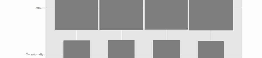
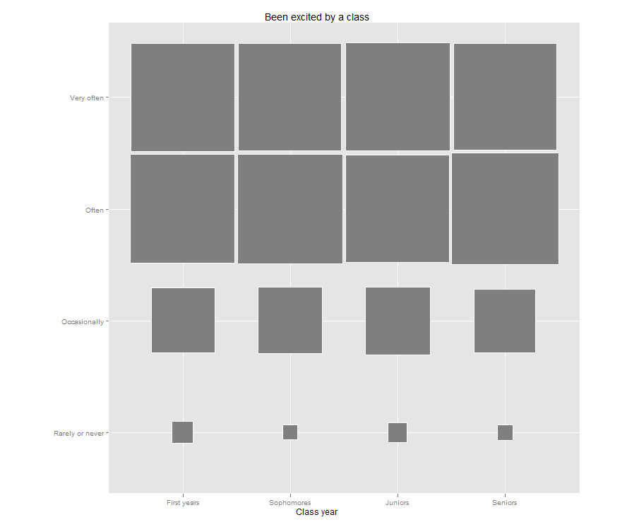
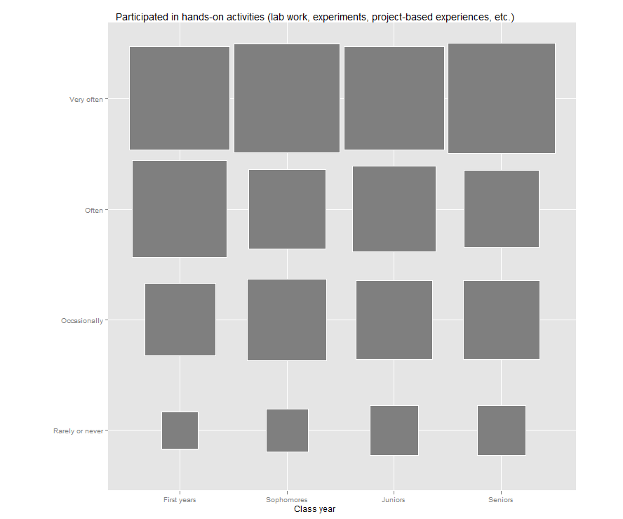
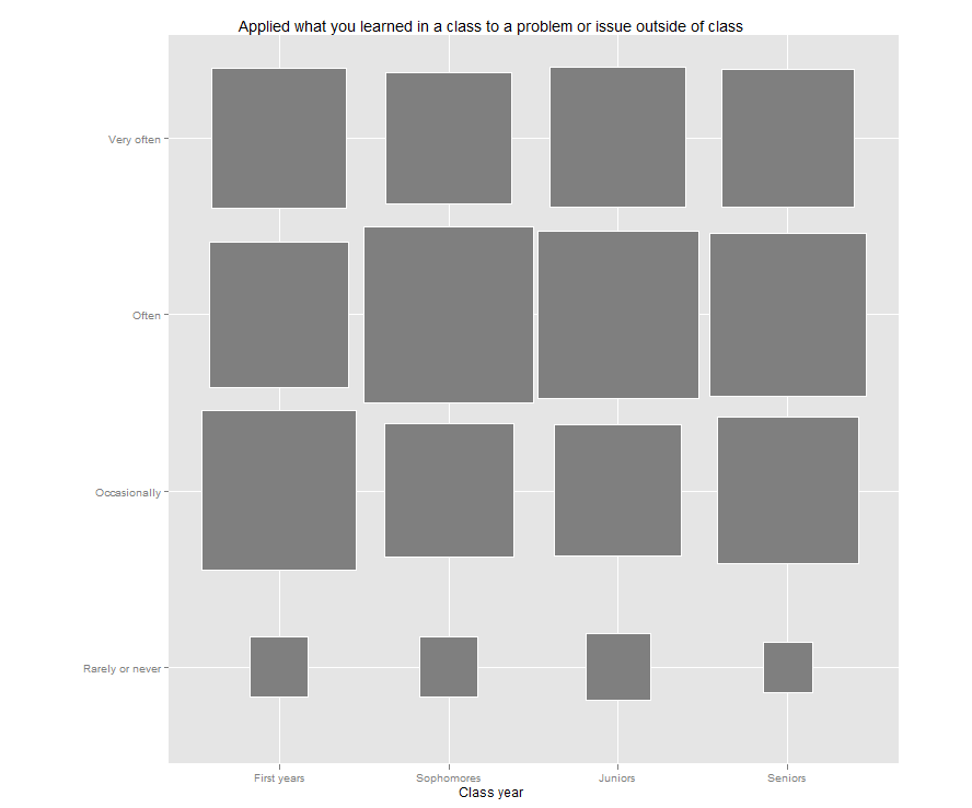
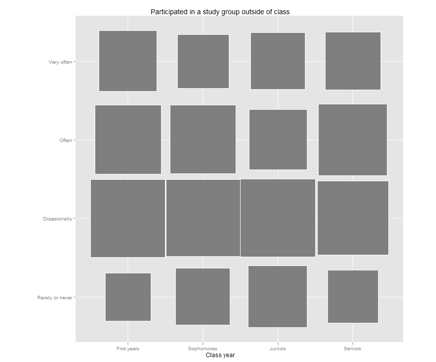
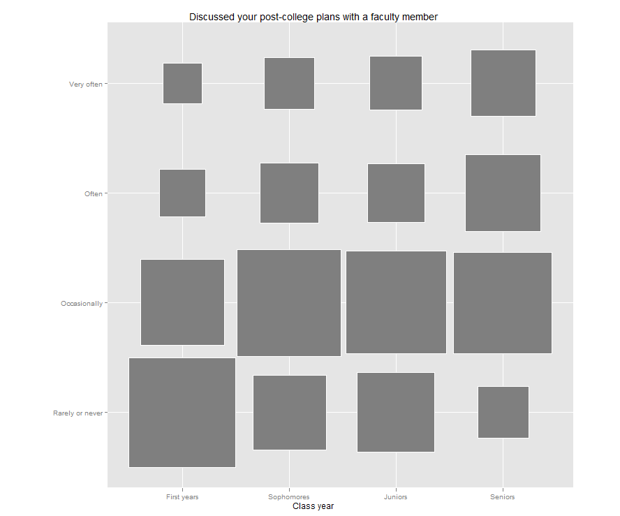
Jason’s post reminded me that I have been meaning to try out a “fluctuation plot” to visualize some recent survey results.  A fluctuation plot, despite the flashy name, simply creates a representation of tabular data where rectangles are drawn proportional to the sizes of the cells of the table.  The plot below has responses to a question about how often students here participate in class discussion along the left side and class year along the bottom.  The idea behind this is to have a quick and very intuitive way to visualize how this item differs (or doesn’t differ) by class year.  In this case, it looks like fewer of our sophomores (as a percentage) report participating in class discussion “very often” than their counterparts.  This may suggest a need for further research.  For example, are there differences in the kinds of courses (seminar vs. lecture) taken by sophomores?

Creating the plot

The plot itself requires only one line of code in R.  If you are not a syntax person, I recommend massaging the data as much as possible in a spreadsheet first.  You can take advantage of a default setting in R where text strings are converted to “factors” automatically.  This default functionality usually annoys the daylights out of R programmers, but in this case, it is actually exactly what you want.

All you need to do is set up your data like this:

Then you can save the file as a .csv and import it into R using my preferred method – the lazy method:

mydata<-read.csv(file.choose())

Nesting file.choose() inside of the read.csv() function brings up a GUI file chooser and you can just select your .csv file that way without having to fiddle with pathnames.

Once you’ve done this, you just need to load (or install then load) the ggplot2 package and you can plot away like this:

ggfluctuation(table(mydata$Response, mydata$Year))

You can add a title, axis labels, and get rid of the ugly default legend by adding some options:

ggfluctuation(table(mydata$Response, mydata$Year)) + opts(title=”Participated in class discussion”,  legend.position=”none”) + xlab(“Class year”) + ylab(“”)

Once you’ve done that, you’ll have just enough time left to prepare yourself for the holiday cycle of overeating-napping in front of the TV-overeating some more.  My family will be having our traditional feast of turkey AND lasagna.  If your life so far has been deprived of this combination, I suggest seeking out someone of Southern Italian heritage and inviting yourself over for dinner.  But be warned – you may be required to listen to Mario Lanza records during the meal.

Happy Thanksgiving!

The WSJ’s “From College Major to Career”

WSJ Major to Career

I am a regular reader of Gabriel Rossman’s blog, Code and Culture.  He posted an analysis yesterday (Nov. 7, 2011) featuring data from an interactive table published in The Wall Street Journal in a series entitled “Generation Jobless.”  The interactive data table can be found as a sidebar to the main article called “From College Major to Career.”

Majored in what when?

Given the focus of the “Generation Jobless” series, I just assumed that this interactive table would depict recent grads.  I was curious about the data used to create the table, so I decided to look into it a bit.  As you can see from the description above the table, it is based on the 2010 Census.   But then at the bottom of the table, the Georgetown Center on Education and the Workforce is cited as the source.  I looked around at the Center’s website and I found what I think might be the WSJ’s source and it is a 2011 report called What It’s Worth: The Economic Value of College Majors by Anthony P. Carnevale, Jeff Struhl, and Michelle Melton.  By scrolling to the bottom of the project page, I was able to find a methodological appendix that explains the data that they used in their analysis.  They used the 2009 American Community Survey (ACS) which apparently for the first time ever “asked individuals who indicated that their degree was a bachelor’s degree or higher to supply their undergraduate major” (Page 1).  If you read on in the appendix you see that “the majority of the analyses are based on persons aged 18-64 year old” and that “for the majority of the report we focus solely on persons who have not completed a graduate degree”.  I looked back at the full report and I don’t see a table that has age categories or a subsection devoted to something like “recent grads”.  It also turns out that this report received some press from both The Chronicle and InsideHigherEd when it was published back in May.  Both of these pieces, which cite the director of the Center and one of the authors of the report, Anthony P. Carnevale, say that the data are from 25-64 year olds.  So if the WSJ is using recent grads or an age category other than 25-64, I’m not sure if they’re getting it from this report (at least not directly).  If the WSJ is using 25-64 year olds, you might be like me and this table might not mean what you think it means.  That is, it might not capture how recent grads are faring in the job market these days.  If it reflects all workers with bachelor’s degrees aged 25-64, you could be getting folks at all stages of their careers.  For example, could these data include a 64 year old who majored in Finance, say, 40 years ago?  Is their experience going to be the same as what is facing a member of “Generation Jobless”?

Again, I don’t know for sure how the WSJ used these data.  Maybe someone else out there has had better luck finding out exactly how the folks at the WSJ have created this table?