The Chronicle’s Recent Take on Data Mining in Higher Ed

Photo by Andrew Coulter Enright

A recent article in The Chronicle of Higher Education titled, “A ‘Moneyball’ Approach to College” (or “Colleges Mine Data to Tailor Students’ Experience”)  presents some ways that data mining is being used in higher ed.  At the risk of sounding like someone overly zealous about enforcing the boundaries around obscure specializations, the article for the most part presents examples of mining instructional practice or the “Learning Analytics/Educational Data Mining” approach which is only a subset of the types of data mining or analytics being done in higher ed.  Examples par excellence of this approach to higher ed data mining can be seen in The International Educational Data Mining Society’s journal and presented at their meetings.

Instead of building Amazon.com-style recommendation engines for courses or analyzing blackboard “clickstreams,” many institutional researchers have been engaged in data mining to deal with some of the perennial questions like yield, enrollment, retention, and graduation – for quite some time.  For example, the professional journal New Directions for Institutional Research  published an entire issue in November 2006 dedicated to data mining in enrollment management.  One of the studies, conducted by Serge Herzog of University of Nevada, Reno, “Estimating Student Retention and Degree-Completion Time” found that data mining techniques such as decision trees and neural nets could be used to outperform tradition statistical inference techniques in predicting student success in certain circumstances.

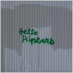
The author of The Chronicle piece writes that “in education, college managers are doing something similar [to Moneyball] to forecast student success—in admissions, advising, teaching, and more”.  This is true, but it has been going on for a long time and in many more ways than just learning analytics and course recommendation systems.  I guess these institutional researchers who have always done data mining were Moneyball before it was cool.  Does that make them hipsters?

Presently Presenting

Present wrapped in red ribbonIn preparing to make a presentation at Swarthmore’s Staff Development Week next month, I thought it would be a good time to review some rules of thumb for making presentations that I’ve learned and discovered over the years.  Because institutional researchers generally have such a range of people in our audiences, it can be tricky!

Power Point – This package is both a curse and a blessing.  As a presenter I like having a visual reminder of key points, and to help frame for the audience where I’m going.  As an audience member I know too well that slides full of text are deadly boring.  Because I am a tactile learner, I have found that I like to organize my presentation by making a text-rich Power Point slide show, but then not actually showing much of it!  The advantage is that I can share the full document later as the version that “includes speaker notes.”  For the actual presentation, I try to use slides primarily for simple charts, illustrations, examples, and a minimal number of bullet points (with minimal associated text).   I want people to engage with what I’m saying, not read ahead.

Tell what you’re going to tell   – The importance of giving your audience a simple outline of the presentation was impressed on me by Alex.   After a particularly boring talk we’d attended, he persuaded me how much better it could have been if we’d simply been able to follow its logic, which an outline would have provided.

Tables – Avoid all but the simplest tables of data in a presentation, and make sure, if you want them to be read, that they are indeed legible from the back of the room.  If I am showing a table primarily to present a layout, I would make clear as soon as the slide is shown that it is not meant to be read.  (This is not uncommon for Institutional Researchers, who share strategies and techniques – sometimes it’s not the data we want to see, but how you presented it!)

Graphs – I personally love a graph that contains a ton of information on one page.  I could stare at it for hours, like someone else might stare at a painting and glean layers of meaning.  Alas, I would try not to make such a graph for others!  In general, the wider the audience, the simpler the chart should be.  Avoid ratios, or even percentages that aren’t immediately grasped.   And be sure to use colors.   A simple, attractive chart that reveals an important relationship can reveal meaning to even the most staunchly anti-data.

Involvement – Whenever possible, I try to involve the audience either through humor (but DON’T overdo it – I’m an institutional researcher rather than a comedian for a very good reason) or engaging with an exercise or activity.  At a faculty lunch presentation a number of years ago, before I began (during lunch), I left displayed a chart reflecting faculty opinions about their adequacy of sleep by career stage.  It certainly piqued interest – people love to hear about themselves!

Certainly none of this is new, but I find it helpful to review and remind myself of them before starting a new project.  As I look back through some of my past presentations I see that I haven’t always followed my own rules as well as I’d wish!   But presentations can be a powerful tool for accomplishing a primary goal of Institutional Research:  getting information to people who need it. And so it’s something I continue to try to learn about and work on.