A few of my favorite things…

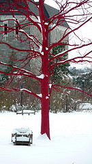
Red Tree
Photo by Will.Hopkins

In a recent post I mentioned one of the things that amused me about Swarthmore when I first started working here. That got me to thinking about all the things that I found, then and now, to be so charming.  So in this Thanksgiving season, I thought I’d share a few of them …

  • Candy or snacks in all of the student services offices, as well as many academic department offices.
  • The occasional frisbee flying into my office (when I was on the third floor) from the adjacent wing of Parrish – which is a men’s residence hall .
  • Former Dean Bob Gross’s springer spaniel, Happy, roaming the hallways looking for the dog treats available to him in all the offices.    And all the other dogs around campus – George and Ali, the bookstore dogs, Dobby, and the rest.
  • Jake Beckman’s (’04) artwork – the big chair on Parrish lawn, the giant sneakers hanging off a chimney of Parrish, and the giant lightswitch on McCabe Library.
  • The tin of candy that one of my colleagues brings to meetings she attends, for sharing.  Round and round the table it goes…  sweet!
  • The fact that so few people refer to their own titles when introducing themselves – just their office.  (A little confusing at first, perhaps, but that’s alright.)
  • The Swarthmore train station (regional rail) at the end of Magill walkway.   In the snow.  It’s like a postcard.
  • The beautiful portrait (painted by Swarthmore’s Professor of Studio Art Randall Exon) in the entryway of Parrish of Gil Stott with his cello.
  • Discovering the hidden talents and passions of people who work here.  There are singers, actors, stargazers, songwriters, woodworkers, animal activists, knitters, world travelers – it’s amazing!
  • The “honker,” which is the Swarthmore’s fire station’s version of a siren.  Of course I’m not happy to think there might be a tragedy – I just enjoy its uniqueness.
  • The labels on all the trees and plantings, because the College grounds are the awesomely gorgeous Scott Arboretum.

I’m sure there are many things I’ve missed.  I’d love to hear about others’ favorites!
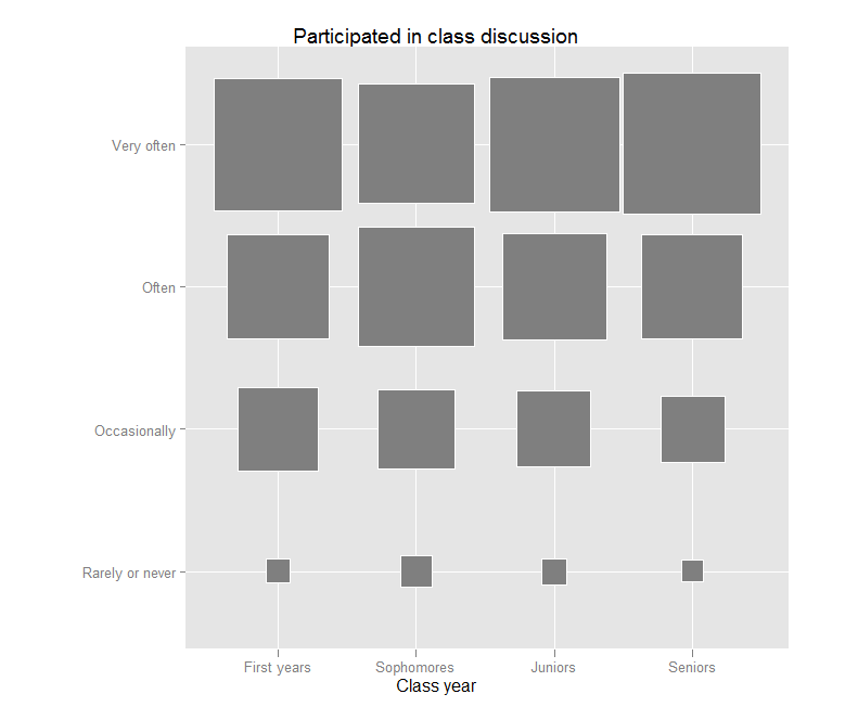
Visualizing Survey Results: Class Discussion by Class Year

Jason Bryer, a fellow IR-er at Excelsior College has a nice post (link) about techniques for visualizing Likert-type items – those “Strongly disagree…Strongly agree” items only found on surveys.  He has even been developing an R software package called irutils that bundles these visualization functions together with some other tools sure to be handy for anyone working with higher ed data.

Jason’s post reminded me that I have been meaning to try out a “fluctuation plot” to visualize some recent survey results.  A fluctuation plot, despite the flashy name, simply creates a representation of tabular data where rectangles are drawn proportional to the sizes of the cells of the table.  The plot below has responses to a question about how often students here participate in class discussion along the left side and class year along the bottom.  The idea behind this is to have a quick and very intuitive way to visualize how this item differs (or doesn’t differ) by class year.  In this case, it looks like fewer of our sophomores (as a percentage) report participating in class discussion “very often” than their counterparts.  This may suggest a need for further research.  For example, are there differences in the kinds of courses (seminar vs. lecture) taken by sophomores?

Creating the plot

The plot itself requires only one line of code in R.  If you are not a syntax person, I recommend massaging the data as much as possible in a spreadsheet first.  You can take advantage of a default setting in R where text strings are converted to “factors” automatically.  This default functionality usually annoys the daylights out of R programmers, but in this case, it is actually exactly what you want.

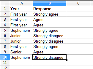
All you need to do is set up your data like this:

Then you can save the file as a .csv and import it into R using my preferred method – the lazy method:

mydata<-read.csv(file.choose())

Nesting file.choose() inside of the read.csv() function brings up a GUI file chooser and you can just select your .csv file that way without having to fiddle with pathnames.

Once you’ve done this, you just need to load (or install then load) the ggplot2 package and you can plot away like this:

ggfluctuation(table(mydata$Response, mydata$Year))

You can add a title, axis labels, and get rid of the ugly default legend by adding some options:

ggfluctuation(table(mydata$Response, mydata$Year)) + opts(title=”Participated in class discussion”,  legend.position=”none”) + xlab(“Class year”) + ylab(“”)

Once you’ve done that, you’ll have just enough time left to prepare yourself for the holiday cycle of overeating-napping in front of the TV-overeating some more.  My family will be having our traditional feast of turkey AND lasagna.  If your life so far has been deprived of this combination, I suggest seeking out someone of Southern Italian heritage and inviting yourself over for dinner.  But be warned – you may be required to listen to Mario Lanza records during the meal.

Happy Thanksgiving!

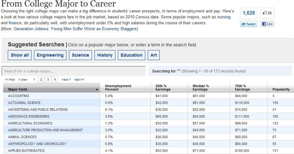
The WSJ’s “From College Major to Career”

WSJ Major to Career

I am a regular reader of Gabriel Rossman’s blog, Code and Culture.  He posted an analysis yesterday (Nov. 7, 2011) featuring data from an interactive table published in The Wall Street Journal in a series entitled “Generation Jobless.”  The interactive data table can be found as a sidebar to the main article called “From College Major to Career.”

Majored in what when?

Given the focus of the “Generation Jobless” series, I just assumed that this interactive table would depict recent grads.  I was curious about the data used to create the table, so I decided to look into it a bit.  As you can see from the description above the table, it is based on the 2010 Census.   But then at the bottom of the table, the Georgetown Center on Education and the Workforce is cited as the source.  I looked around at the Center’s website and I found what I think might be the WSJ’s source and it is a 2011 report called What It’s Worth: The Economic Value of College Majors by Anthony P. Carnevale, Jeff Struhl, and Michelle Melton.  By scrolling to the bottom of the project page, I was able to find a methodological appendix that explains the data that they used in their analysis.  They used the 2009 American Community Survey (ACS) which apparently for the first time ever “asked individuals who indicated that their degree was a bachelor’s degree or higher to supply their undergraduate major” (Page 1).  If you read on in the appendix you see that “the majority of the analyses are based on persons aged 18-64 year old” and that “for the majority of the report we focus solely on persons who have not completed a graduate degree”.  I looked back at the full report and I don’t see a table that has age categories or a subsection devoted to something like “recent grads”.  It also turns out that this report received some press from both The Chronicle and InsideHigherEd when it was published back in May.  Both of these pieces, which cite the director of the Center and one of the authors of the report, Anthony P. Carnevale, say that the data are from 25-64 year olds.  So if the WSJ is using recent grads or an age category other than 25-64, I’m not sure if they’re getting it from this report (at least not directly).  If the WSJ is using 25-64 year olds, you might be like me and this table might not mean what you think it means.  That is, it might not capture how recent grads are faring in the job market these days.  If it reflects all workers with bachelor’s degrees aged 25-64, you could be getting folks at all stages of their careers.  For example, could these data include a 64 year old who majored in Finance, say, 40 years ago?  Is their experience going to be the same as what is facing a member of “Generation Jobless”?

Again, I don’t know for sure how the WSJ used these data.  Maybe someone else out there has had better luck finding out exactly how the folks at the WSJ have created this table?