So today I turned my attention to a bit of institutional homework I was assigned, to find out how some of Swarthmore’s peer institutions approach neuroscience, whether it’s a department or a program, how many positions are dedicated to it, etcetera.
Let’s talk about how someone who knows relatively little about academia might view such a page. Let’s say it was a 16-year old high school student who was absolutely certain they wanted to study neuroscience and also absolutely certain they wanted to attend a small liberal-arts college.
Let’s say our aspirant neuroscientist starts with Swarthmore. Unusually, Swarthmore (at the moment) lists its programs of study on its front page. Most colleges bury that listing two or three pages deep. So no digging required in this case: the prospective student will see the following right at www.swarthmore.edu:
No neuroscience. Or so it might seem. Here the classic problem that it takes some knowledge to get some knowledge rears its head. Hopefully the aspirant neuroscientist knows where this discipline is coming from (biology and psychology in the main, though as we’ll see, there are exceptions.) So maybe she’d notice the following at the Psychology Department’s departmental page:
But how to interpret this? There’s a major, but it’s not listed. Worse yet, if the prospective clicks on that link, they’re going to be pointed to a Google doc that you have to have permission to view. Which this person won’t have. So here we see the first problem with departmental webpages at your average college site. They offer an uneven range and quality of information without a clear picture of the multiple audiences that might be seeking information. (Trust me, we’re typical in this respect: I am not singling out my colleagues here.) What should our prospective conclude in this case? That whatever Swarthmore has, it’s new or not a strong part of the institution’s curriculum.
Let’s just say our prospective wants to be absolutely sure and proceeds to look at Psychology’s faculty listing. This kind of listing also varies enormously in formatting. To an outsider, much of the information on a typical listing of faculty will be difficult to decode. Some simple rules:
Faculty described as professor or associate professor are usually tenured faculty. Meaning they have met the requirements for tenure and that they are likely to be around for the foreseeable future until they retire or move to another institution. Faculty described as assistant professor are tenure-track (meaning they will come up for promotion to tenure in the future) but have not been tenured yet. Faculty who have a “named position” (“Dorwin Cartwright Professor of Social Theory and Social Action”) are senior faculty who have been appointed to special “chairs”, often a sign of prestige or accomplishment. (A “chair” in this sense is different from the department chair, who is the current administrative head of an academic department.) All of these faculty occupy regular “lines”: counting them gives you a sense of the stable size of a department relative to others at the same institution. You might get some rough sense of the age or seniority distribution in a department by noting the distribution of ranks within it.
Faculty listed as emeritus or emerita have retired. You can’t tell much from the listing alone of whether they’re an active presence in the department. Faculty listed as visiting assistant/associate professors are generally some kind of experienced temporary faculty. Lecturers are faculty who are often (though not always) temporary who may be hired to address additional subject areas or to address short-term pressures on an existing department. Faculty who are described as none of these terms are also likely to be either temporary or to have institutional responsibilities besides teaching. In some cases, senior administrative officers of a college (such as a president, provost or dean) may be listed in the faculty of a given department. These are sometimes honorary listings, but in any event, these officers are usually not active teachers in that department while they are serving in administration.
Basically, count the tenure-track faculty for a reliable measure of the predictably available teaching resources.
The final thing you might find on a departmental listing is the research and teaching interests of faculty. This also is variable: some departmental webpages treat this information like it is a secret, or put it in a separate layer below the departmental listing. At Swarthmore Psychology’s webpage, you’ll see some concise, clear listings of interests under each faculty member’s name. In our department, you won’t see “neuroscience” as a single word, but if our prospective knew something about the field, they’d probably spot about 2, maybe 3, faculty with interests lying within neuroscience.
Let’s try neuroscience at Williams.
Where do you go? Well, there’s always the expedient trick of Googling “Williams neuroscience”. But let’s do it the old-fashioned way, by drilling down the links. At the Williams main page, you’ll see:
“Academics” is generally going to be the place that you find listings of departments, programs, majors and other curricular items. The next page at Williams has another listing to parse: “Departments and Programs” is what’s wanted. One page deeper and our prospective is eagerly scanning down the list of departments. It’s not there! But wait, look at the second column, under “Programs Offering Concentrations”. Bingo! There’s neuroscience.
Only, what’s a “Program Offering Concentrations”? Do NOT expect college webpages to ever explain like this anywhere but about five fathoms deep in their official handbooks. In general, a department is a more stable, longer-established administrative unit that offers a regular course of study and some kind of certification on graduation. “Program” means something a bit more tentative, often newer. “Department” means “discipline”, “Program” often means “interdisciplinary”. But this is not always the case. Swarthmore has programs older than some of its departments, some of its programs think of themselves as offering a discipline, and a few programs have more participating faculty than some of the smallest departments. Students (and faculty) often perceive departments to be more powerful, resource-rich and prestigious, but some programs are deliberately loose or unstructured for some purpose and yet have plenty of resources. In short, it’s hard to say what exactly this means when you see it. As a rule of thumb, you can guess that a “program offering a concentration” or any similar phrase means a course of study that is an institution is trying to do in a more tentative, potentially reversible way by bootstrapping the resources of some existing departments in a new direction.
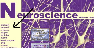
Let’s click on Williams’ program. Hey, snazzy graphic, but also a pretty clean page in terms of the information navigation it offers. Betcha didn’t know that neural systems came in Williams’ colors.
Before you click on anything in the left-hand menu, take a second to parse what each of those links will likely tell you. “Program” usually means a description of the structure of a major or minor, though that might also be under “Courses”. “People” usually links to faculty and staff, and “Research” will often tell you about what they do but also about what labs or work they’ve been doing with students. Some departmental websites have a listing of additional resources about this area of study, though these are often badly out of date. The “Essel Program” listing tells you that this program has a stable source of external funding–which our aspirant neuroscientist might realize could translate into some sort of support for internships or research fellowships for students.
Let’s say our prospective decides she wants to see what courses the program offers. Here she’ll find a disappointment that is very common to college websites. The course titles are available but they are not linked to anything more detailed. If they are linked, it’ll often just be to a one-paragraph description in the catalog. Very rarely will a departmental website facilitate an information-seeker to drill down into syllabi or any more detailed information about courses. Nor will links to faculty or research typically connect to actual publications by faculty. At best you might find an abbreviated c.v.
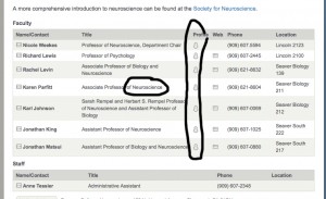
Still, the Williams site gives the prospective some sense of what neuroscience at the college is like. Looking at the “People” link, the prospective will find out how many students have chosen the concentration since 2009 (a hint that this is when the program might have started) and will find faculty listed as “Professor of Biology” or “Associate Professor of Psychology”. What does the “of Biology” mean in this kind of listing? That this faculty member’s tenure line is not in Neuroscience, but in that other department. And here we see the most common meaning of “program” versus “department”: departments control tenure lines, programs “borrow” their resources from elsewhere. But this doesn’t tell you anything about what that commitment is like: sometimes faculty in departments are much more strongly committed to a program than their “home” department. It does tell you that faculty might be pulled in two directions, however.
Let’s try two more quickly. How about Pomona? As with Williams, it’s three links deep to the listing of departments. (That Google search is looking better and better all the time.) When you arrive at Neuroscience, you find it’s a bit difficult to tell: is it a department? a program? The language seems to imply it’s a department. Some faculty are listed as “Professor of Neuroscience”, a suggestion that their tenure line is in Neuroscience, not something else. But, if you can navigate the somewhat confusing faculty guide embedded in the department’s webpage to look at faculty profiles (click on the little chess piece icons),
you find that the faculty listed as “of Neuroscience” are in their own profiles listed as “of Biology” and “of Psychology”. (Also, the vaguely conspiratorial notation that these profiles are “External Only” appears.) This is going to take a bit more sleuthing, which means leaving Pomona’s web architecture. Lo and behold, one Google search later, we find that Professor Karen Parfitt has left a presentation up on the web that explains everything. It was a program that started out of student interest, it grew enormously, and in 2010-11 it became a department. Current faculty have tenure lines in both neuroscience and other departments but the “of Neuroscience” presumably means that this is where those tenure lines will be in the future.
This is all information that you’d be able to get pretty quickly if you were at Pomona, I think. But it’s not what college websites are used to communicate, for the most part.
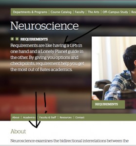
Let me point to a college website that I found frustrating: Bates College. It’s got a strong graphical design that’s consistently held several layers down. Good for them. But when I drill four click layers down to get to neuroscience, here’s what I find:
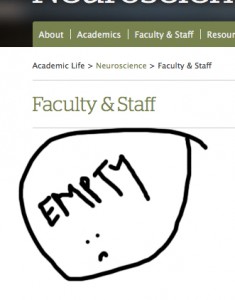
Still a default to big pictures and words. The superficial admissions-brochure description of neuroscience actually requires me to scroll down at the default display size to even read the whole thing, and the pictures are utterly banal images of happy students, nothing to do with the department, program or whatever. When I click on Faculty and Staff in the mid-page banner, here’s what I get:
To look at the faculty and staff associated with neuroscience, I have to pull down the menu from Faculty & Staff and look at each one of them individually. I can’t call up a page with all four of them. No, it’s worse than that, I need a pull-down menu for each faculty person to separately look at their teaching, research, and so on. (Though I can get a .pdf of syllabi, so that’s nice.) Seriously, this makes clear that Bates doesn’t think I’m going to want to go that deep, or that if I want that information, I’ll find it elsewhere: the webpage is for nice pictures of nice students associated with nice-sounding ad copy.
—————-
A few modest proposals:
It wouldn’t hurt anyone if college webpages had an archival or curatorial function, particularly at the departmental level. I keep a Twitter window open to the keyword Swarthmore: I get a pretty interesting picture of what’s being said about the college that way. I should be able to find Karen Parfitt’s slides from inside Pomona’s web architecture. Most importantly: I should be able to go straight from faculty directories to syllabi and at least some online publications. That should be standard within the next decade. Honestly, it should be standard now.
It wouldn’t hurt anyone if the descriptions of programs were punchier, more engaging, more real. Faculty love to complain about administrative-speak, committee-speak, but I’d make a guess that many of the deadliest, most abstract descriptions of departments, disciplines and programs were written by faculty.
College webpages in general should very quickly yield in their architecture to different kinds of searchers. The prospective who is exploring, the colleague who is doing institutional research, the outsider who is looking for a directory, the alumni who is trying to find out what’s up back at the alma mater, the journalist who wants to know what “Cultural Studies” is, the community member looking for a class to audit, should within three clicks find themselves in an architecture of link structures and discovery that is friendly to their intent.
Colleges should provide a clear lexicon both of terms and concepts common to higher education as a whole and specific to their curricula and it should be one click away at all times.
Listings of programmatic resources (faculty or otherwise) that obscure the quantity or stability of those resources are at the least confusing, at the worst deceptive. I’m not linking to the worst I saw in this search, but there’s a couple of institutions that struck me as actively puffing their programs up to two or three times their real size.
Links that lead to dead, old, or private pages are bad and yet are also surprisingly common.





I certainly hope you’ve seen this very relevant XKCD comic.
Yes! To everything!
The only problem is (or at least is at my grad institution) that overhauling a website is often done by committee. And that means no one ever agrees. On anything. So when I was on the website redesign committee, our dept website went from hideous colors and unnavigable to less hideous colors (but oddly not our school’s colors…) and slightly more navigable (but there was still dissent about what should be included under which menu option). It was rather infuriating to design a dept website by committee.
And as someone on the job market with a PhD, I find it hard enough to find sufficient information about some depts/schools/faculty/labs to write a proper cover letter… I can’t imagine what prospective undergrads and prospective grad students go through to find that info!
A big problem with web pages these days is that the content-editing interfaces are getting harder (at least at Swarthmore College), so even if faculty had “real” stuff to write, they’d need to pass it along to somebody else, and that’s a hurdle that causes most departments to have a 90s feel to them (i.e, frozen in amber). Other pages get written by committee, which quickly becomes a de facto model for future pages.
I sure wish that syllabi and online courses were viewable by students. Locking that access to just campus would be easy (stick files in .htaccess folders).
Check out Skitch of you haven’t already: http://skitch.com/ … great for circling things on screen captures.
Oh how much I agree with this!
As part of a self-study, I looked at the studio art/art history/architecture (if such a thing existed) at our standard comparison institutions. I never figured out Sarah Lawrence’s web page and declared defeat. The other 15 were differing in their approaches to confusing the visitor — but none had been designed with the clarity you suggest.
Of course, part of our problem is invisible to outsiders – our own confusing department history. We used to be a “mixed” art department, both art and art history, that took the lion’s share of duty in running an interdisciplinary program in architectural studies physically housed in our building but whose majors take about half of their coursework in things like environmental studies and urban studies. The last provost shoved the architectural studies program inside our structure, so now we’re the Department of Art and Architecture. Architecture still has its own budget, though. Very confusing! And three separate web pages on the Academics index.