I’ve been exploring Flickr and 500px a lot over the last month, partly as a way of sharpening my own growing interest in photography and visuality. Both sites, however, are also fantastic case studies of the evolving character of social media and digital culture, and my examination has done a lot to sharpen my sense of what’s wrong, what’s right and what’s interesting about the state of the art in social media.
I. Interface, Energy and Sociality
Flickr has been called out recently by tech writers for its moribund, sluggish response to the rise of Instagram, 500px, Smugmug and other photo-publishing and photo-archiving services. Flickr still has a huge community of users and there is still a tremendous amount of daily activity at the site. As an archive of images, it still has no rivals in large measure simply because it’s been around as long as it has without major traumatic changes to its functionality or accessibility.
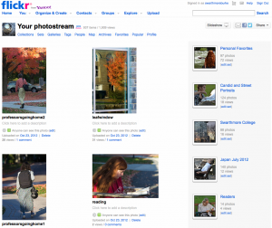
However, it’s easy to see why both commenters and users (both at Flickr and in other communities) see Flickr as dying or stagnant. “See” is the operant verb here. Before you ever dig down to the myriad of groups at Flickr to find that all but a small number of them have had no discussion or administrative oversight for months or years, you can see it in the default visual design.
All the crucial functionalities you might seek in a visual publishing platform that also serves as social media are present somewhere in that interface: links to other platforms; the ability to customize sets and collections of material; user control over levels of access to material; multiple ways for users to comment upon, bookmark and curate the material of other users. But then look at 500px.
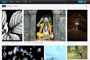
Most of the same functionalities are present somewhere in 500px’s interface, with one huge exception (to which I’ll return shortly). But 500px’s designers understand that the content of the site is visual, so the user controls and publishing tools are hidden “under the hood”. The pictures control the interface and the interface’s presentation shifts upon each reload, creating an endlessly dynamic relation between the images that creates an exciting meta-image: it allows a viewer to find surprising associations between images, to see each picture in a new way each time it is encountered. This is true whether I’m looking at my Flow, which is built up from the activity of users that I’ve chosen to follow (the images they’ve liked, they’ve favorited, they’ve posted), looking at Fresh (new postings), looking at Popular (highly rated), or Editors’ Choice (hand-selected images).
500px’s sensitivity to visual design might be attributed to the fact that its creators are skilled photographers, or to the declared central goal of the site (to provide top-flight photographers with a publishing platform with a built-in payment system), or to its creation in a more recent and bandwidth-intensive era. Or conversely, to the fact that Flickr was an accidental offshoot of a design process that wasn’t intended to produce a photo-sharing service and has since undergone several changes of ownership and configuration that have prevented any possible comprehensive redesign of the site’s appearance.
The causes are less important than the consequences. The first consequence is a recursive mimesis: 500px’s look intuitively persuades a user that the site is devoted to rich, spectacular visuality, and the spectacular visuality of the good images is enhanced both by the way that they appear in isolation and in concord with others. 500px’s interface automatically associates everything posted to the site together via a single channel (Fresh) and mixes together everything that a user’s hand-picked group of other users bookmarks or likes (Flow).
You can see the same thing on Flickr, but it takes going two or three clicks deep via Explore. It’s not a default gateway into the site itself–the story at Flickr is your photostream, not Flickr as a whole. When I go to 500px, I often spend time just looking before I go into my own profile to tinker or survey activity on my pictures. When I go to Flickr, I might occasionally choose to go to Explore to see what’s new and interesting, but I’m as likely to go to my Contacts or to the groups I follow. I don’t ever see images with the same sense of dynamic presentation and juxtaposition: they all appear in little boxes. Flickr is the visual equivalent of a particularly static and uninvolving 9-panel grid comic-book layout put up alongside a dynamic comic-book layout by Jim Steranko or J.H. Williams.
The visuality of 500px lends it speed as well: users can shift between different collections of images quickly and down to the level of individual images or the collected works of a single photographer and back again with a minimum of clicks and a very intuitive interface design. Getting around Flickr is much slower and much less intuitive: seeing content without a specific predetermined search takes much more understanding of the site, not just its interface but its community and culture. It is much easier to simply look at 500px. The interactivity of the site is often a goad for traversing its visuality: ah! there is another great picture, click “like” and oooh! yet another, favorite it. The results of your own curation of other people’s work into Favorites are a thrill, like traversing a private museum. Looking at your favorites on Flickr is a much less visually rewarding experience.
And yet, if you want to go deeper, below the surface, there is almost nothing to 500px: it’s all image and no scaffold. Visuality is the alpha and omega of its community: exchanges between users are limited to the comments at the bottom of photos and to a very badly designed support forum that is palpably both an afterthought and a reluctant concession. By design (both in the aesthetic sense and the business-plan sense) words and all they enable don’t belong at 500px. Flickr, on the other hand, has as much room for words as users would like to claim. Though many groups and fora have gone relatively silent, there are still areas of strong activity, where users talk to each other using both words and pictures. (I find the group Photography Critique particularly interesting and useful, for one example.)
This difference both affects the kinds of sociality that are possible at the respective sites and reflects the kinds of sociality that they aspire to. 500px was founded with the clear intent to help photographers sell their images, either directly off the site or to build reputation capital for their professional work. In this it has so far been successful, from what I can see. If I were looking for a wedding photographer today and money was no object, I’d be able to find a good ten to thirty from 500px who were incredibly exciting and distinctive in their work. (For example, the Israeli photographer Victor Vertsner, whose work I could easily favorite in its entirety.) In pursuit of this constituency, 500px’s interface is much less friendly to copying or reusing the work of its users, and it has incorporated a sales mechanism into the core design, unlike Flickr’s rear-guard relationship to Getty Images.
A richer set of community tools and platforms for communication at 500px could aggregate, collate and connect users in a much greater variety of ways–and in so doing, subvert the desire to produce separation between the commercially viable photographers and everyone else, as well as allow words to ‘work’ the images in ways that run counter to the site’s aesthetic objectives and identity. All social media communities that have hierarchies or intentional separations between aspirational groups within the community run into trouble about the management of those separations where the groups overlap.
As 500px has become more popular, it has drawn three other communities: amateurs with no commercial ambitions (like me) who are hoping to learn and improve via posting and viewing; people who take and post pictures from their own lives and experiences and use the platform to share this documentary record with family and friends; and a more shadowy group that uses such sites to deposit and circulate copyright-violating or illicit images. (What complicates the fourth group’s activities is that one group of commercially-viable photographers on the site are creators of original erotic photography, whose work is subject to a complex set of filters and disincentives. More on this in the next post of my series.)
The amateurs who are learning benefit from the much more rapid iterative loops within the site’s interface design: it is in that sense like a digital camera itself, showing you almost right away how images attract or disinterest their viewers. But to learn in that fashion, they need the precious commodity of the Internet age, attention. The more that the non-commercial amateurs use the site’s mechanisms to draw attention, the more potentially rivalrous they are with the people who need that attention to make a living. At the other end, the amateurs who hope to be seen as photographers have an equal felt need to separate themselves from the people just sharing their vacation shots and baby pictures–but for that group, the attention provided by the site can be both a source of amusement in its own right and a way to make social connections to strangers.
500px has had several implementations of a “dislike” button that I believe they may feel helps to manage these rivalrous borderlands and keep the site’s identity clearly focused on their core constituency. The problem, as always, is that social media designers believe that sociality follows from design. Instead, as Flickr demonstrates, it follows from history, usage, custom and culture, from the actual users in the actual situated lives that a site attracts–both those it attracts on purpose and those it attracts by accident. Design and interface are the material preconditions of social practice in digital media, but once a sociality takes its emergent shape in a new site, it can have a remarkably adaptive, plastic and durable spirit that subverts, protests or ignores attempts by designers to push and pull it where they want it through recoding and refurbishing. At some point, every successful social media site needs to hire more sociologists and anthropologists and fewer coders if it wants to understand what it has become and might yet be.


