Making Thematic Maps and Census Data Work for IR

Illustrating Geographical Distributions and Describing Populations Using Data from the U.S. Census Bureau

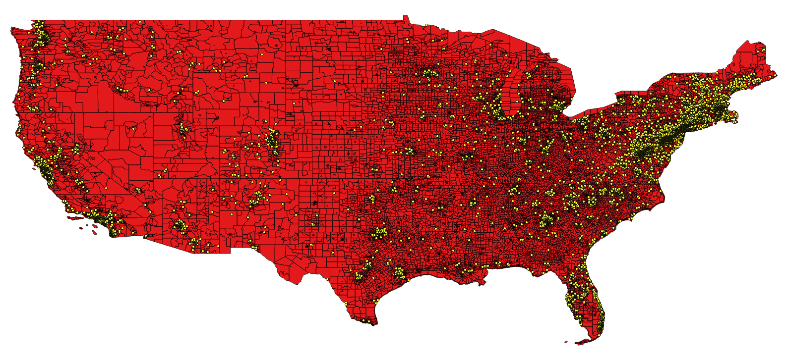
In a previous post I give an example and step-by-step instructions for the geocoding process (converting street address locations to lat/long coordinates). In another previous post I give an example and step-by-step instructions on how to use QGIS to illustrate the spatial distribution of geocoded addresses as a point and choropleth map as well as how to perform a ‘spatial join’ that will identify each location with an associated geography (using a geo identifier for Census tract, zip code, legislative district, etc – whatever your geographic level of interest).

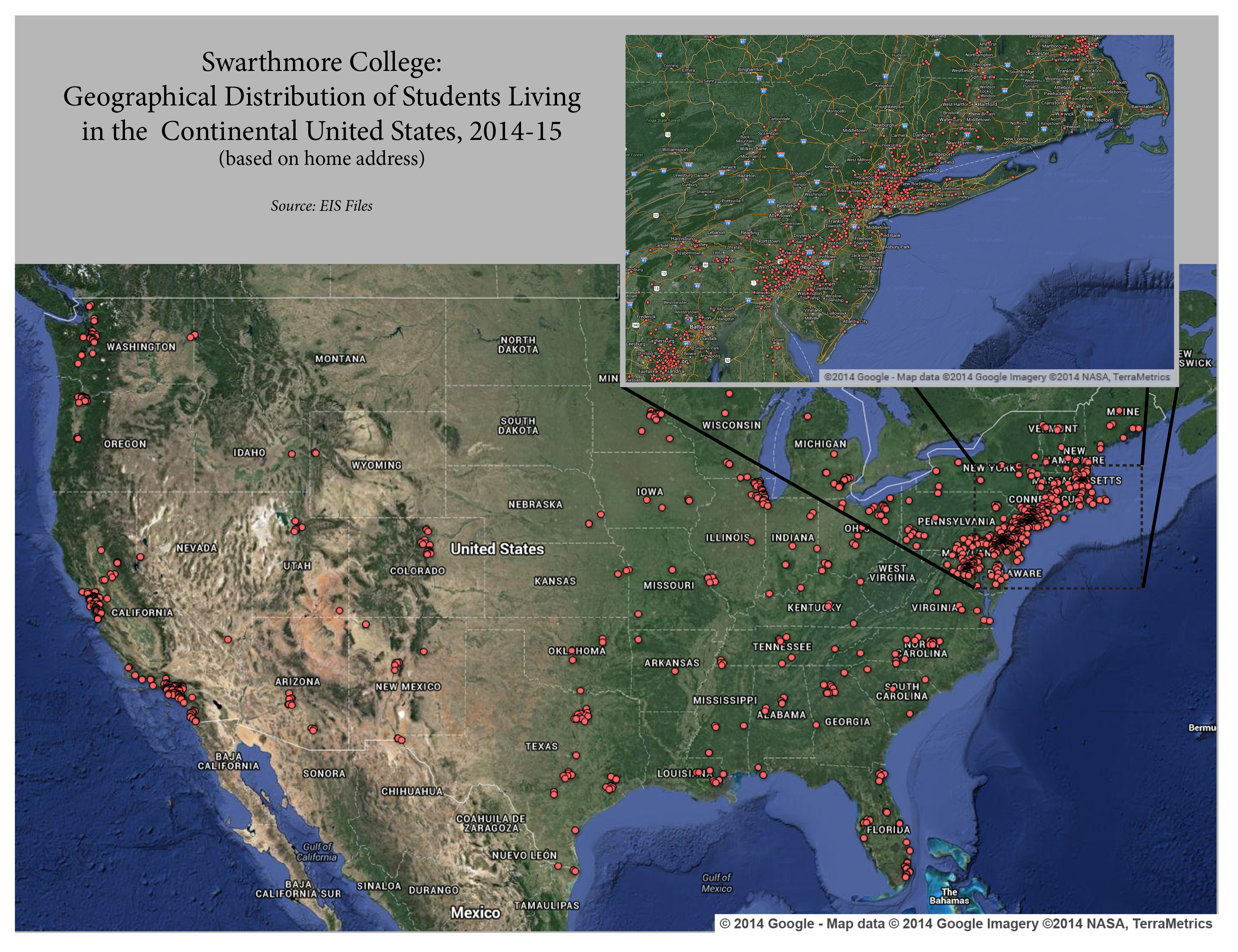
In the current post, using ArcMap rather than QGIS (though it is the same conceptual process), I provide an example and step-by-step instructions for taking this one step farther and joining actual U.S. geography-based Census demographic data to the address locations file without ever leaving the ArcMap platform.

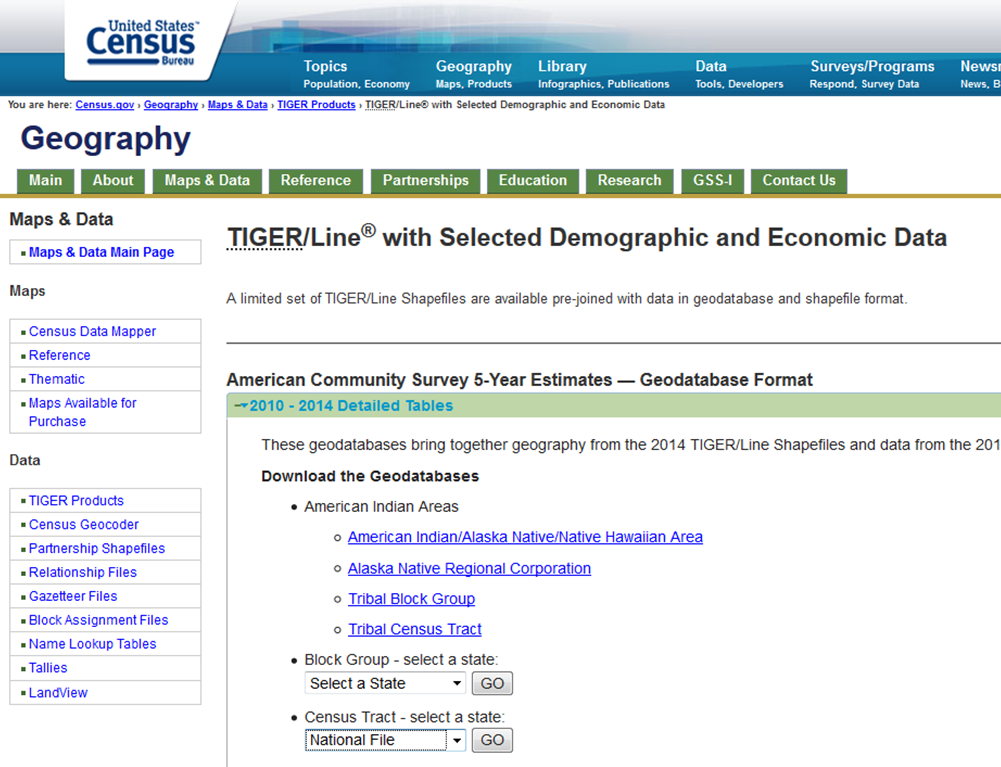
Step 1, Download the Tract Shape and Data File: The U.S. Census Bureau provides downloads that contain both the tract level shape file (the underlying map) along with selected demographic and economic data. These data are derived from the American Community Survey (ACS) and are presented as five-year average estimates since the ACS is carried out through sampling and it requires a five year pooling of the data to arrive at reasonably accurate estimates. In this case I have elected to download the national file that reflects the most recent 2010-14 tract level data estimates. Click here for a direct link to the U.S. Census Geodatabases page.

tiger-file-download

Continue reading Making Thematic Maps and Census Data Work for IR

Where in the World is Everyone? Part Two

Part Two: From Geographic Location to Neighborhood Profile

In Part One of this two part blog post I explained how to start with a list of street addresses and, using Google’s Fusion Tables function, map those locations onto an interactive Google Map. This tool alone can be very useful and powerful in the context of institutional research and administration. However, where spatial analysis becomes significantly more powerful is when you use these known locations to find out more information about the specific communities and neighborhoods of students and alumni. Through the use of spatial analysis software, these “point” locations can be tied directly to zip codes, census tracts, block groups, Congressional districts, etc. From there, geographic data from the Census Bureau’s American Community Survey or other sources can be used to understand a great deal about where the community and neighborhood profile of students and alumni. It’s only a proxy for the individual and we always need to be aware of the Ecological fallacy, but you can gain immense and detailed understanding of a group just by learning about their spatial location.

geo_2_image_7

The following is a guide for taking individual records (including street addresses), overlaying geographic boundaries (such as tracts, zip codes, etc.), joining (or combining) the individual records with their respective geographic descriptors (e.g. Student A lives in zip code 12345), and finally, joining/combining geography-based data from the US Census’ American Community Survey to those individual records (e.g. Student A lives in zip code 12345, which has a population of 3,500, a median household income of 65,000 dollars per year, and so on).

Continue reading Where in the World is Everyone? Part Two

Where in the World is Everyone? Part One

Part One: Making Use of Mapping in Institutional Research

A good visual can be a helpful tool considering that the job of an Institutional Researcher is to keep the attention of people who have many important things to do with their time and little time to spend wading through a lot of text and long explanations. Enter mapping and spatial analysis. Maps generally make for familiar, easy to read, and aesthetically pleasing images that grab viewers’ attention and, when carefully constructed, do a very good job of communicating information. They are nice to look at, but they can also tell us relevant and important about our institution. I elaborate on a specific technique in this post (Part One) and delve more deeply into the topic in a follow-up post (Part Two). In this post I illustrate a simple but effective technique for mapping point locations. In the following post (Part Two), I discuss some of the potential deeper applications for mapping and spatial analysis in Institutional Research.

Current_Student_Home_Addresses_Continental_US_2014-15

Continue reading Where in the World is Everyone? Part One