Part One: Making Use of Mapping in Institutional Research
A good visual can be a helpful tool considering that the job of an Institutional Researcher is to keep the attention of people who have many important things to do with their time and little time to spend wading through a lot of text and long explanations. Enter mapping and spatial analysis. Maps generally make for familiar, easy to read, and aesthetically pleasing images that grab viewers’ attention and, when carefully constructed, do a very good job of communicating information. They are nice to look at, but they can also tell us relevant and important about our institution. I elaborate on a specific technique in this post (Part One) and delve more deeply into the topic in a follow-up post (Part Two). In this post I illustrate a simple but effective technique for mapping point locations. In the following post (Part Two), I discuss some of the potential deeper applications for mapping and spatial analysis in Institutional Research.
Mapping Point Locations
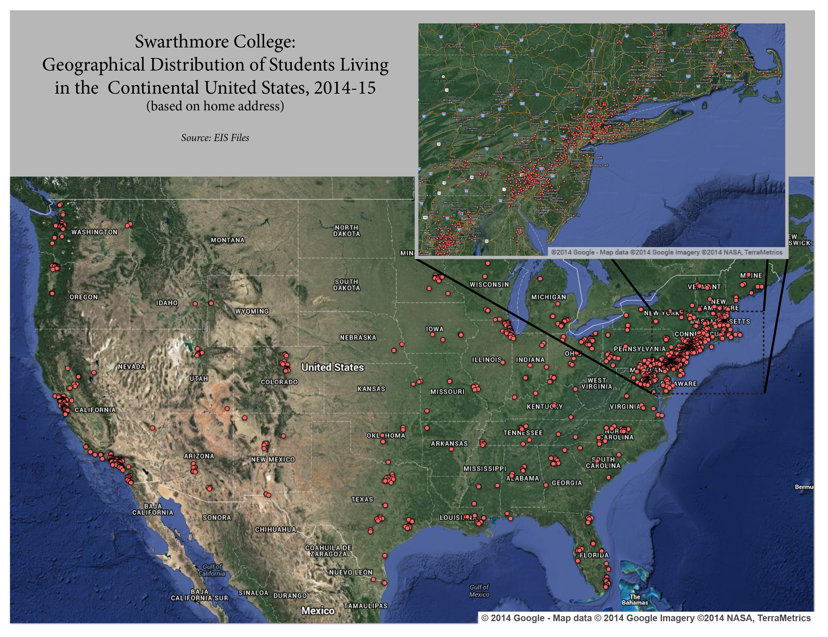
Google Fusion Tables and Google Maps combine to provide the function of creating maps that illustrate specific street address point locations. This functionality is versatile and helpful to IR and other offices in a variety of ways. It allows the user to create a map showing the distribution of individuals across a geographic area. Such representations show very clearly to admissions offices and development offices, for instance, where students and alumni are concentrated and, when looking across time, how those patterns have changed and developed over the years. Furthermore, the map marker icons used to indicate specific street addresses can be changed in accordance with certain characteristics in the data. For instance, all first-years could be represented in red, all sophomores in blue, all juniors in green, and all seniors in yellow – (See below, step six). Google Maps also include an information bubble for each data point. When a user clicks on any data point, an information bubble appears that includes selected information about that case – e.g. respondent #1 is a first year, engineering student, who plays tennis and live on campus – (See below, step six). Once the specifications for the map are set, it can be shared with other selected users by simply entering their email address – (See below, step five). Alternatively, the static map image can be captured and imported into PowerPoint or another program for presentation – (See below, step seven).
Step-by-Step Guide
**Note: the data below does not come from actual student records**
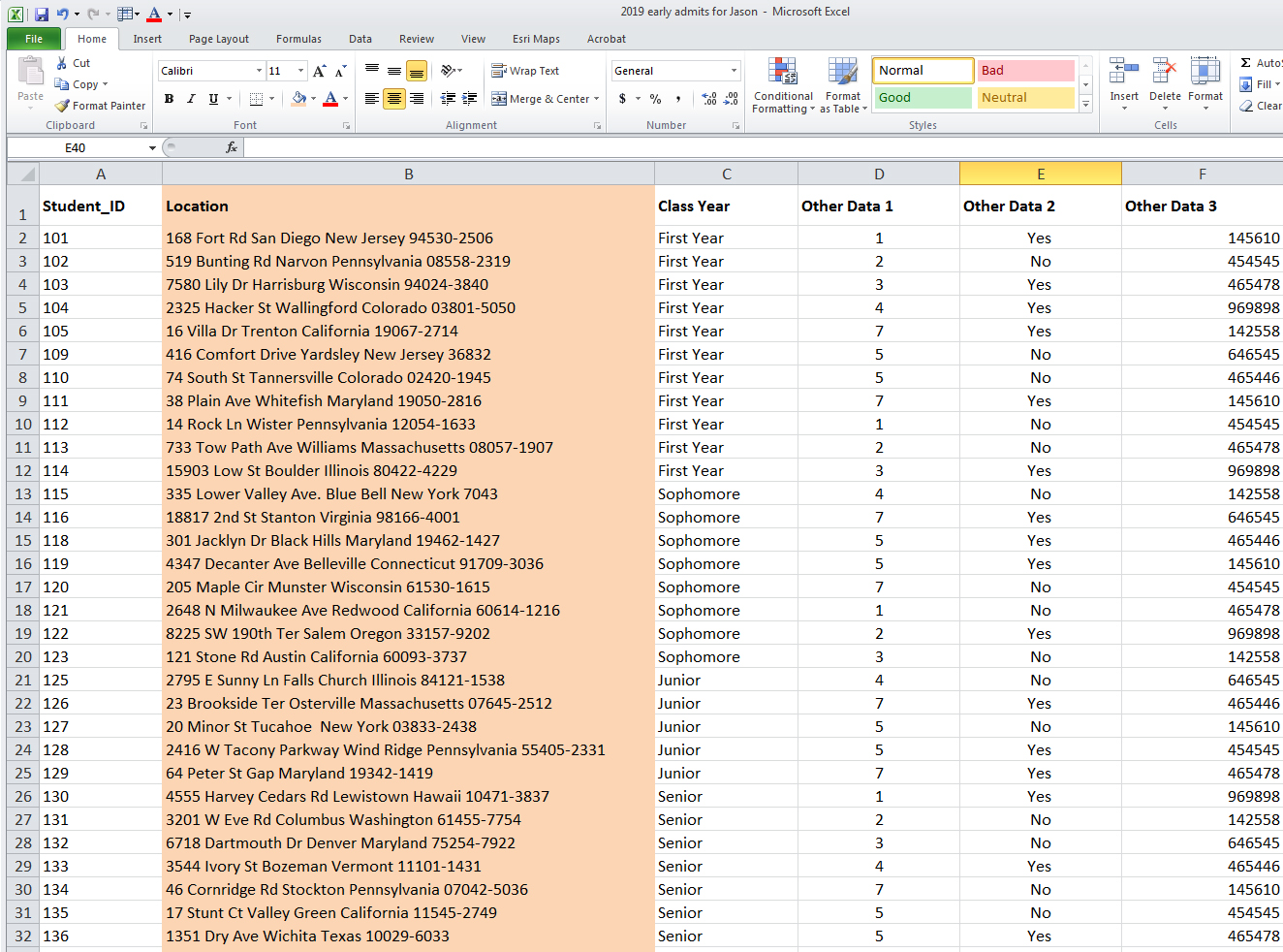
Step 1: Starting with a simple spreadsheet containing street, city, state, and zip along with whatever other data it may contain, we want to make sure it is as clean as possible. This is just simple stuff like removing information in the wrong fields, eliminating a lot of extra data like apartment numbers etc. This increases the likelihood of finding the point location accurately.
Step 2: The entire address (including street, city, state, and zip) should be consolidated to a single column (using Excel’s text combining command “&” if necessary). It is helpful to label this column something descriptive such as “location.”
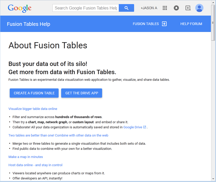
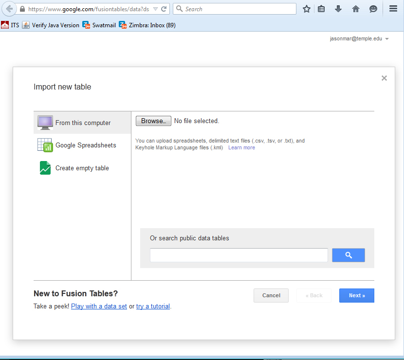
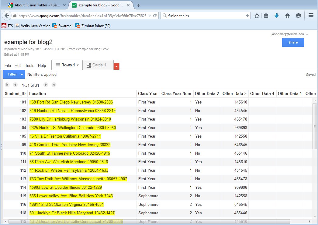
Step 3: The next step is to convert the data sheet containing the addresses (along with any other relevant variables) into a CSV file and then upload to Google Fusion Tables. (This does require signing in to a Gmail account). Click on “Create A Fusion Table” and then use the “Browse Function to locate the CSV file containing your addresses.
Step 4: Now that the data is imported we can review the table itself for the columns we expect to see. It is important to classify the column containing the address as a “location” field. To the right of each column’s header, there is an arrow which, when selected, allows the user to “change” the variable type. Once selected, this column can be changed to a “location” format so the mapping utility will know which column to geocode (geocoding is the process of translating street addresses to coordinates – latitude and longitude). Note that the address column’s contents should now be highlighted in yellow. If any other fields are also highlighted in yellow, their variable type should be changed to “text.”
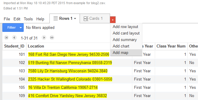
Step 5: Along the top of the table, to the right of the “Rows” and “Cards” tab, there will be an orange tab with a plus sign on it. Clicking on the plus sign and then on “Add Map” will start the process of geocoding the location column. When finished, this tab will display your point locations overlaid on a dynamic Google Map. This map works just like any other Google Map in that it allows you to zoom to the desired level and the toggle back and forth between a political and satellite map. There is also a “share” button in the upper right corner of the window that allows you to grant access to the map through an email invite.
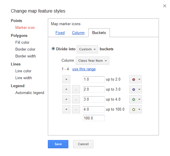
Step 6: There are several helpful map configuration options available to the user. Two of the most useful involve “changing feature styles” and “changing info window” (see left hand column). “Changing feature styles” not only allows the user to select the type of map marker icon used, it also allows the user to change the marker icon color based on values of another variable in the data. For instance, if the uploaded spreadsheet contains values one through four, indicating first-years through seniors, each class year can be denoted by a unique color. After selecting “Change feature styles,” the “buckets” tab allows the user to divide the marker icon color based on user defined intervals of any quantitative variable.
 The “changing info window” function allows you to determine how much or little information about a specific case is reported in a data window when the user clicks on a specific map marker icon. The user selects the specific variables whose attributes will be displayed in the information bubble.
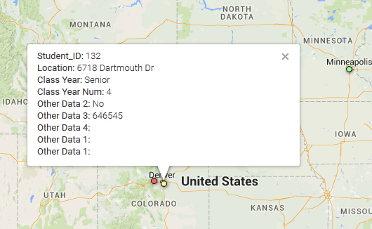 Step 7: If you want to create a static map for a presentation or report (such as the one pictured above) there is no built-in download option but one way to save the map image is to zoom to the desired level and capture the screen image (print screen for PCs). Then you can paste this into PowerPoint – or any program with similar functionality – and crop the image as desired. For copyright reasons, you should maintain Google’s copyright stamp that they include on all of their maps (This is a required aspect of proper attribution).
Since this is done through a Google Account, you can always return to the map by looking for the table in Google Drive and choosing the option to open with Fusion Tables. Just remember that it will stay there until you take it down. Theoretically the data is securely available only to you and to anyone for whom you provide access, but considering the ubiquity of data breaches it is certainly best practice to exclude or mask any sensitive data that may be present in individual records.
