
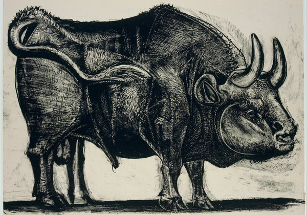
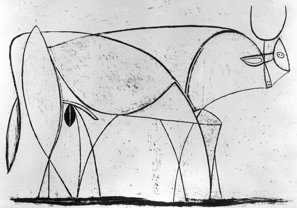
Brian Chen’s NYTimes’ August 11th article on design training at Apple is fun and informative, particularly the anecdote about design decisions that led to a Google TV remote control with 78 buttons (all the design teams got what they wanted) vs. the Apple remote eventually distilled to just 3 buttons. But in using 4 famous Picasso graphics of a bull and comparing it to the famous evolution of Apple’s mouse design, the article makes an amusing error. Read on and see what you think.


 Yes, the mice designs progress nicely toward greater beauty, driven by ergonomic science, refinements in “click” and wireless technology, and an aesthetics of simplicity and abstraction. (Note also how the Apple logo becomes progressively more prominent with each redesign.)
But it’s a mistake to see Picasso’s lithographs as a similar demonstration that greater abstraction = greater beauty. Or, as the Times clumsily asserts, “the drive to boil down an idea to its most essential components.” Picasso’s works are NOT meant to be interpreted on a sliding scale moving from good to better. Each drawing succeeds on its own aesthetic logic, with #2 above being especially interesting since it is willfully heterogeneous in techniques in tension, mixing lines and solids and giving Picasso ideas that he’ll explore in the next 2 lithographs.
There’s also this fun fact to consider: if Apple really wants to argue that Picasso’s last lithograph in the series is “better” than the first, just as Apple’s last mouse is better, Apple and the NYT need to acknowledge that Mr. Bull’s brain and his, um, phallus have greatly been shrunken by Picasso’s changes! Anyone who knows Picasso knows that he considered both to be rather important “component parts” of male identity. Picasso’s 4 lithographs experiment with 4 different, equally interesting ideas of where (male) strength and beauty come from. Imposing a tech progress narrative on the arts causes lots of distortions in understanding how art actually works, including the ones vividly illustrated here.
[Bull images by Art Resource, NY; 2014 Estate of Pablo Picasso/Artists Rights Society (ARS), New York.]