Speedy PSPP

GNU PSPP logoYes, someone is using that acronym for their software.  And yes, I promise not to make any bad jokes that reference the early 90s rap song, also with an acronym.  If you’re not sure which song I am referring to, so much the better for you.

PSPP is intended as a “free replacement” for SPSS.  Since I’m not a big user of SPSS, I had not paid PSPP much attention until just recently.  The reason I looked at PSPP a second time is that I wanted to quickly open a .sav file (the SPSS native file format) to look at value labels.  We have access to SPSS here at the college, but why PSPP offered an alternative in this situation is that we access a networked version of SPSS which can take some time to open.  PSPP, on the other hand, is very light and can reside on my machine.  So I decided to give it a try and found that I can open data sets very quickly.

I was so impressed with the speed improvement that I changed the .sav file type association on my machine to PSPP.  Of course, what better way to show one’s appreciation!  Now, keep in mind that I do not use SPSS much at all and PSPP only offers what they call a “large subset” of the capabilities of SPSS, so this may not be a suitable replacement for the SPSS overachievers out there.  You can also open .sav files in R using the read.spss command in the foreign package, but if you’re like me and you might want to look at them first, PSPP allows you to do this.  It also offers the opportunity to work with SPSS files at home, for those of us for aren’t going to want to purchase an SPSS license for the home computer.

If others have PSPP experiences to share, I’d love to hear them!
 

Mapping Student Counties

Photo by Aram Bartholl

We thought it might be interesting to create a map of the home counties of our domestic students.  Since this is something that I have seen done in R and I am always up for trying to sharpen my R programming skills, I thought I would give it a shot.

My first step was to retrieve zip codes for all current students from Banner.  I am able to do this using the RODBC package in R.  This requires downloading Oracle client software and then setting up an ODBC connection to Oracle first.  Once this is set up, I can connect to banner, enter my username and password, and then pass a SQL statement to Banner.  Here is the code for this step:


library(RODBC)

prod<-odbcConnect("proddb")

zip<-sqlQuery(prod,
paste("select ZIP1 from AS_STUDENT_ENROLLMENT_SUMMARY where TERM_CODE_KEY=201102 and STST_CODE='AS' and LEVL_CODE='UG'"))

odbcClose(prod)


This creates an R dataframe called “zip” and closes my RODBC connection to Banner. The example that I am following uses FIPS county codes, so I will need to prep these zip codes for use with a FIPS lookup table by first making sure they are only 5 digits. Then I import my FIPS lookup table (making sure to preserve leading zeros) and merge with student zip codes. Once I have done this, I can get the counts of students in each of the FIPS codes.

zip$ZIP<-substr(zip$ZIP1,1,5)

fips<-read.csv("C:/R/FIPSlookup.csv",
colClasses=c("character","character"))

m<-merge(zip, fips, by="ZIP")

fipstable<-as.data.frame(table(m$fips))

Now I can proceed with the example that I am using.  This example comes from Barry Rowlingson by way of David Smith’s “Choropleth Map Challenge” on his excellent, all-things-R blog.  I chose this method because it does not rely on merging counties by name, but instead uses FIPS codes – which we now have thanks to the steps above.

Then I use the “rgdal” package to read in US Census shapefile (available here), prep the FIPS codes in the shapefile and match with our student counts, and assign zeros to counties with no students:

library(rgdal)

county<-readOGR("C:/Maps","co99_d00")
county$fips<-paste(county$STATE,county$COUNTY,sep="")

m2<-match(county$fips,fipstable$Var1)
county$Freq<-fipstable$Freq[m2]
county$Freq[is.na(county$Freq)]=0

Following Rowlingson, we use the “RColorBrewer” package and his own “colorschemes” package to get the colors for our map and associate them with counts of students. We then set the plot region with blank axes, add the counties, and then draw the plot:

require(RColorBrewer)
require(colourschemes)

col<-brewer.pal(6,"Reds")
sd<-data.frame(col,values=c(0,2,4,6,8,10))
sc<-nearestScheme(sd)

plot(c(-129,-61),c(21,53),type="n",axes=F,xlab="",ylab="")
plot(county,col=sc(county$Freq),add=TRUE,border="grey",lwd=0.2)

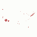
Click the thumbnail below to see the resulting map:

As you can see, the map is pretty sparse as you might expect with 1531 students from 325 different counties.  This represents only a first pass at trying this, so there will be more to come, possibly a googleVis version.  If others have had success with the above approach, we would love to hear about it in the comments!

To get more info about the geographic distribution of our students (both international and domestic), check out the “enrollments” section of our Fact Book page here.

The R syntax highlighting used in this post was creating using Pretty R, a tool made available by Revolution Analytics.