Anecdotes versus Data: A False Dichotomy

Photo by Image Editor

Anecdotes often get a bad rap – sometimes deservedly. We have all seen examples of narratives plucked from the public smorgasbord and used to prop up a pre-conceived ideology. Given the prevalence of this often irresponsible and manipulative use of narrative [discussed further in the Huffington Post’sThe Allure of an Anecdote”] it is easy to lose faith in the power of stories. This periodically leads to a surge in demand for hard data and evidence regarding everything from healthcare to higher education. But data and statistics take their fair share of heat as well. For one thing, it turns out that data analysis is subjective too. Data can be manipulated, massaged, and infused with bias. And the strictly ‘objective’ quantitative analysis tends to come across as cold, devoid of feeling, and uninteresting. We know enough to know that numbers never tell the whole story. Standardized testing alone is a grossly inadequate assessment of educational enrichment and when organizations uncompromisingly focus on ‘the bottom line,’ it makes most of us uncomfortable at best.

This methodological tension is an exemplar of how the solution is rarely to be found in the extremes. Unfortunately, these two approaches to knowing the world have such strong advocates and detractors that we are often drawn toward diametrically opposed camps along a false continuum. Compounding the problem is that shoddy and irresponsible research at both ends of the spectrum is regularly circulated in mainstream media outlets.

This divorce is particularly problematic given that quality science, good journalism, and effective research tend to integrate the two. So-called “hard data and evidence” need narrative and story to provide validity, context and vitality. On the other hand, anecdotes and narratives need “hard data and evidence” to provide reliability, and to help separate the substantive from the whimsical. In responsible and effective research and analysis, the methodological dichotomy is brought into synergy, working together as structure and foundation, flesh and bone. The Philadelphia Inquirer printed a series on poverty in 2010 that serves as a good example from the field of journalism [“A Portrait of Hunger”]. Done effectively, data and narrative are inextricably melded into a seamless new creation.

In my short time thus far in Institutional Research at Swarthmore, I have been impressed by many things, one of which is the simultaneous respect for research and evidence-based decision making alongside respect for stories, nuance, and humanity. When the values and mission of a college call for an environment that respects both, it facilitates the practice of effective and balanced institutional research.

Time flies…

Pumpkin carved with "SUN"
photo by thinkgeekmonkeys

The fall has been whizzing by, and here it is Halloween already.   I shouldn’t be surprised, it’s been busier than ever.   (I know. I say that every year.)   We’ve completed two massive projects involving tracking student enrollment and outcomes over multiple cohorts and years, and another one that was small potatoes after those.  The Associate Provost and I have spent a ton of time building on the considerable work of our Middle States Periodic Review Report (PRR) Steering Committee to create a first draft of the report.     Our new IR staff members and I have worked together to get up to speed (including the Fall freeze and fall IPEDS reporting).    We’ve fielded four five! surveys (so far), and are getting pretty darned good at Qualtrics.   (Nothing like troubleshooting to help you learn something.)  I’ve gone through the CITI training for IRB and feel incredibly ethical.    And of course we’ve dealt with all the usual ad hoc requests and miscellany.  But with some of this big stuff behind us, and what is turning out to be a terrific IR team, it’s like the sun coming out.  For the first time in a year it seems we’re almost caught up.  We freeze employee data tomorrow, so that may not last long.

Happy New Year!

http://www.flickr.com/photos/darwinbell/
photo by Darwin Bell

Having worked in higher education for all of my adult life, I’ve never gotten over that “kid” feeling that September represents a new year.   More than January, it offers new beginnings and possibilities.   Faculty members come back from their summer activities recharged, and with new ideas and projects.   Our students return, literally, in earnest.   The quiet, sunny paths become challenging to navigate as people Have to Get Somewhere.   My new year’s resolution for this fall is to enjoy these moments.   I love helping a first-year student find a building, or hearing a student talk excitedly on their cell phone to a parent about a new class.  Or seeing a faculty member help a new colleague understand our customs and practices.  (“What’s a WA?!”)  When not too busy helping faculty and staff with their new ideas and projects, Institutional Research has a moment to catch its breath before our fall freeze, and watch the excitement.    My wish for the College in this new year is peace, love, and understanding.

Data Disconnect

Sadly, Thursday’s “Headcount” blog of the Chronicle reports on another institution misrepresenting data that is used in the US News rankings.   While there is plenty in the topic to be upset about, I found myself annoyed by this statement:

Nevertheless, replacing hard-and-fast numbers with mere estimates involves a conscious choice, and, it’s fair to assume, an intent to polish the truth.

Certainly there are situations when the intent is to “polish the truth,” and I have no idea whether this was the case at this institution, but I actually think it’s UNfair to assume the intent.   Continue reading Data Disconnect

Why IR is hiring

Application_Page_1With an increasing amount of my time for the past two years spent with the Provost’s Office and the College in general helping to guide our assessment efforts, the IR Office has been struggling mightily to keep up with our work.   In January we were approved for an additional limited term position in the IR office to help offset the loss of my time.  The need for the position will be reevaluated in three years, which corresponds to the term of the new (second) Associate Provost position.   This is not an accident.  Since both positions are intended to relieve overloads caused, at least in part, by our needs for assessment and institutional effectiveness leadership, it makes sense to review this new infrastructure a few years down the road to see how it is serving us, as our assessment processes improve and our work becomes more routine.

With this additional IR position and Alex’s departure, I’ll be in a way replacing both Alex and myself, as I continue focusing more on assessment and on our upcoming accreditation mid-term report.   But while Alex and I shared much of the responsibilities for IR reporting and research in the past, I’ll be structuring the two positions to more separately reflect these two key roles.   A Data and Reporting Officer will have primary responsibility for data management, and routine and ad hoc reporting for internal and external purposes.  An Institutional Research Associate (the limited term position) will focus more on special studies, and is expected to provide the advanced analytic skills to our projects.   These two positions, and mine, will share somewhat in responsibilities and have just enough overlap to serve us in those many “all hands” moments.   It should be an exciting time for Institutional Research – and for assessment!

Keeping Score

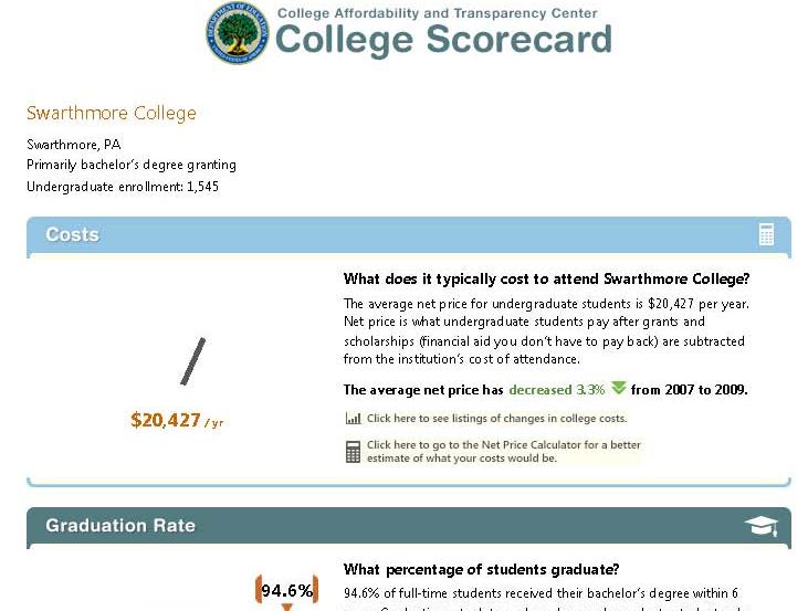
SwatScoreSmPresident Obama announced the new “College Scorecard” in his state of the union address, and the interactive online tool was released the next day.  The intended purpose of the tool is to provide useful information to families about affordability and student success at individual colleges.  Since then, the IR community has been buzzing.   Much of the data in the tool is reported via the IR offices, and many of us are already being asked to explain the data and the way it is presented.  Several of our listservs became quite busy as my colleagues compared notes on glitches in the lookup feature of the tool (zip codes searches were problematic early on) and the accuracy of the data, and debated the clarity of the labels and the wisdom of the simple presentation.

This project is an example of a wonderful goal that is incredibly hard to execute well.   Seeing all the press coverage (both mainstream and higher ed press) and hearing from my colleagues, I think about the balance of such a project.   It seems reasonable that after thorough development and testing, there would be a point at which the best course of action is to just move forward and release it even though it is not perfect.   But where is that point?  One could argue whether this was the correct point for the Scorecard project, but all of the attention is creating increased awareness by the public, as well as pressures on the designers for improvement, and on colleges for accuracy and accountability.

HarmGoodSmall

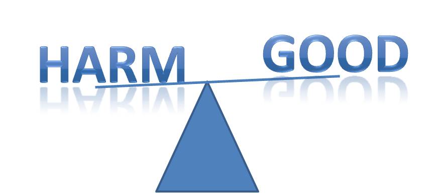
I wonder how many people remember the clunky online tool, COOL (the College Opportunities On Line), from the early 00’s, and the growing pains that it went through as it evolved into the College Navigator, a pretty spiffy – and very useful – tool for families to find a wealth of information about colleges?   These things evolve and if not useful and effective, won’t survive.   The trick is not doing more harm than good while the kinks are worked out.

What’s in the Scorecard and where did it come from?   The Scorecard has six categories of information:  Undergraduate Enrollment, Costs, Graduation Rates, Loan Default Rate, Median Borrowing, and Employment.   Information about the data and its sources can be found at the Scorecard website, but it takes a little work!   Click on the far right square that says “About the Scorecard” on the middle row of squares.  From the text that spins up, click “Here”, which opens another window (not sure if these are “pop-ups” or “floating frames”), and that’s where the descriptions are.

The data for the first three items come from our reporting to the federal government through the IPEDS (Integrated Postsecondary Education Data System), which I have posted about before.   Here is yet another reason to make sure we report accurately!  The next two categories, Loan Default Rate and Median Borrowing, get their data from federal reporting through the National Student Loan Data System (NSLDS).   The last item, Employment, provides no actual data, but rather a sly nudge for users of the system to contact the institutions directly.

While each of these measures creates its own challenge to simplicity and clarity of explanation, one of the more confusing, and hence controversial, measures is the “Cost.”   The display says “Net price is what undergraduate students pay after grants and scholarships (financial aid you don’t have to pay back) are subtracted from the institution’s cost of attendance.”  This is an important concept, and we all want students to understand why they should not just look at the “sticker price” of a college, but at what students actually pay after accounting for aid.   Some very expensive private colleges can actually cost less than public institutions once aid is factored in, and this is a very difficult message to get out!  But the more precise definition behind the scenes (that floating frame!) says “the average yearly price actually charged to first-time, full-time undergraduate students receiving student aid at an institution of higher education after deducting such aid.”  The first point of confusion is that this net price is calculated only for first-time, full-time, aided students, rather than averaged across all students.   The second is the actual formula, which takes some more digging.   It uses the “cost of attendance,” which is tuition, fees, room, and board, PLUS a standard estimate of the cost for books, supplies, and other expenses.   The aid dollars include Pell grants, other federal grants, state or local government grants (including tuition waivers), and institutional grants (scholarship aid that is not repaid).   And the third point that may cause confusion is, of course, the final, single figure itself which is an average, while no one is average.

Will a family dig that deep?   Would they understand the terminology and nuances if they did?   Would they be able to guess whether their student would be an aid recipient, and if so, whether they’d be like the average aid recipient?   The net price presentation that already exists in the College Navigator has an advantage over the single figure shown in the Scorecard, because it shows the value for each of a number of income ranges.   While aid determinations are based on much more than simple income, at least this presentation more clearly demonstrates that the net price for individuals varies – by a lot!

Walking the Walk

walking feet
photo by :::mindgraph:::

In spite of providing support to other areas of the College undertaking assessment projects, like many IR offices, ours had yet to fully engage with our own assessment.  Sure, we had articulated goals for our office some time ago, and had reflected on our success on the simpler, numeric ones, but only this year (as part of increased College-wide efforts) began to grapple seriously with how to assess some of the more complex ones.

One of our take-aways from the Tri-College Teagle-funded Assessment project that we’ve been involved with was that the effort to design rigorous direct assessment is key, and the work that goes into thinking about this may sometimes be even more important than the measurement itself.   It’s one thing to observe this, and quite another to experience it firsthand.

As Alex and I looked at our goals, each phrase begged clarification!  We don’t want to just conduct research studies, we want to conduct effective studies.  But what do we mean by “effective”?   How do we meet our audiences needs?   How do we identify our audience’s needs?   What is the nature of relationship between the satisfaction of a consumer of our research and the quality of the research?   And on and on.   Before even identifying the sorts of evidence of our effectiveness that we should look for, we had already identified at least a dozen ways to be more proactive in our work.

The other revelation, which should not have been a surprise because I have said it to others so often, is that there are seldom perfect measures.   Therefore, we need to look for an array of evidence that will provide confidence and direction. There are many ways to define “effective” research – what is most important (and manageable) to know?

And finally, it’s easy to get caught up in these discussions and in setting up processes to collect more and more evidence.   We could spend a lot of time exploring how a research study informed someone’s work and decision-making, but that time that could have instead been used in expanding the study.   We have to find a balance, so that we do assessments that are most helpful, and don’t end up distracting us from the very work we’re trying to improve.

The Importance of IPEDS

IPEDS FormThe IR responsibility of providing summary data to the federal government through the Integrated Postsecondary Education Data System (IPEDS) sounds like as much fun as completing tax forms.   And as a matter of fact that analogy pretty much captures it!   It’s an obligation of all institutions that participate in any kind of Title IV funding programs (federal student financial aid), which means that like death and taxes, it affects just about all of us.  Assembling and providing this information is not always easy, but it’s a responsibility that we take very seriously, and we do our best to work effectively with our colleagues internally so that we provide the most accurate data possible.

I recently attended a workshop to become a “trainer” for IPEDS.  The Association for Institutional Research (AIR) works with the National Center for Educational Statistics (NCES) to provide training and support for both submitting data and using the data that NCES makes available to the public.   It’s a really wonderful program of online tutorials, face-to-face workshops, and other activities that promote understanding of this important resource, and I’m excited about being involved.  I’ve always been a girl scout about this stuff anyway, but the workshop reinforced just how valuable and PUBLIC! a resource this is.  Once submitted (and after the agency’s review and consistency checking) this information becomes available to the public through the IPEDS Data Center.   That means that anyone can use it …and they do!   Policy analysts, legislators, reporters, grant agencies, prospective students, administrators at peer institutions, accreditors, job-seekers, higher education researchers, the list is endless.    The accuracy of data can reflect on individual institutions – you really don’t want to show up on the U.S. Department of Education’s list of institutions with the fastest increasing tuition because you couldn’t be bothered to double-check your numbers – but it also has implications for policy, research conclusions, and many other decisions that affect the higher education community.

Telling Stories

Storybooks on a shelfLast week I participated in a workshop sponsored jointly by the Center for Digital Storytelling (CDS) and Swarthmore College.  It was an intense three-day experience, in which about a dozen participants were taught the basics of constructing an effective narrative using images, music, and voice.   The folks from CDS (Andrea Spagat, Lisa Nelson-Haynes) were just wonderful – skilled, patient, experienced – as were our ITS staff members who supported the workshop (Doug Willens, Michael Jones, and Eric Behrens).

I had wanted to learn more about this technology to see if it might be a useful way for IR to share information with the community.  I can envision short, focused instructional vignettes, such as tips on constructing surveys, everyday assessment techniques, or even how to interpret a particular factbook table that is vexing.   (Generally, a table that requires instructions ought to be thrown out!)   We may try one of these and see how it goes.

I learned about the technology, but I also learned some amazing stories about my Swarthmore colleagues who participated with me.   These stories often reflect important personal experiences, which could have been difficult to share if it weren’t such a supportive environment.  An unexpected outcome of the workshop is that a group of colleagues all got to know each other a lot better!