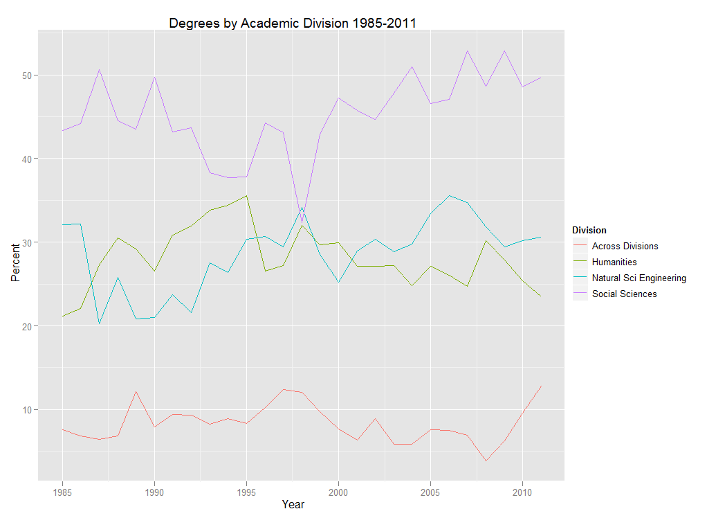
There always seems to be plenty of discussion in higher ed about the shifts in student interest in the academic disciplines and divisions over the years. The issue has probably taken on a heightened sense of urgency in the last few years with the economic situation, prompting statements about the “death” or “rebirth” of certain disciplines. So what’s my take on it? I’d be happy to share some lengthy tome, some 1,000 word screed on the subject, but instead… Check out the p r e t t y c o l o r s!
The chart above depicts the percentage of degrees awarded at Swarthmore by academic division. Percentages are based on the number of majors, so graduates with double majors may appear in more than one division if their majors were in different divisions. (For more info on degrees, head over to the “degrees” section of our Fact Book page).
In addition to having pretty colors, this chart also happens to be very easy to make in R. In fact, if your data are arranged properly, which you can always do ahead of time in Excel, this chart can be created using one line of code with the ggplot2 package:
qplot(Year, Percent, data=mydata, colour=Division, geom=”line”, main=”Degrees by Academic Division 1985-2011″)
If you are new to R and you are like me and hate worrying about getting the file path right when reading data into R, save your data as a .csv file and use file.choose:
mydata<-read.csv(file.choose())
You could also just highlight the data in Excel, copy it to the clipboard, and then read it into R, being sure to tell R that the data are tab-delimited:
mydata<-read.table(file=”clipboard”, sep=”\t”)
So there you have it, an increase in pretty colors with a minimum of effort which surely means more time for Angry Birds important stuff.


