The End

Goal posts
Photo by DB-2

“Begin with the end in mind” is Stephen Covey advice I’ve always found useful.  Some people ask what you would want to have written on your tombstone.  (Writing this post on Halloween may be influencing my choice of images here!)   But in making many decisions I’ve found it helpful to think about what path I might wish I had chosen if I looked backwards from the future.  Many of us wrote “Histories of the Future” as part of our thinking about Swarthmore’s strategic planning.  Envisioning what you would like to see is a way of thinking through and clarifying your goals and what you might need to do to get to them.

Good assessment takes the same first step.  Rather than thinking about what things you could most easily measure, or how to prove the worth of your activities to an external audience, you start by articulating what results you would like your activity to achieve.  What are the key things that I want my students to have learned when they finish this course? What should a student who majors in my department be able to know and do when they graduate?  For an administrative department, what should be the result for someone working with my office?  What are the key outcomes that should be accomplished by this project?

This exercise is valuable before you ever start thinking about capturing information.  Having a conversation about goals with departmental colleagues can be challenging, but very rewarding, because so many of our goals are implicit.  Trying to capture them in words and hearing others’ thoughts make us think about them in new ways.  Explicitly identifying the goals of an activity can put a different frame around it.  As part of our tri-college Teagle Foundation grant “Sustainable Departmental Level Assessment of Student Learning,” one faculty member remarked that going through the exercise of stating goals and objectives has already changed the way she approached teaching her course.  It sounds hokey, but it really can be transforming.

If you’re just starting to think about this, look for places where you’ve described what you do.  How have you described yourself on your web site, in printed materials, or even in your job ads?  These sort of descriptions often reflect our priorities and goals.  Does your professional association offer any guidance on student learning outcomes, or on best practices?   These are all great starting points for this important work.   Later on, only after articulating goals and, based on them, more specific objectives, does it make sense to begin thinking about collecting information that might reflect them.
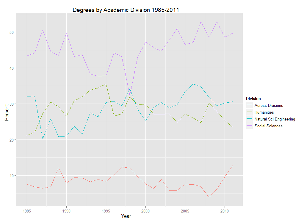
 

Degrees by Academic Division 1985-2011

There always seems to be plenty of discussion in higher ed about the shifts in student interest in the academic disciplines and divisions over the years.  The issue has probably taken on a heightened sense of urgency in the last few years with the economic situation, prompting statements about the “death” or “rebirth” of certain disciplines.  So what’s my take on it?  I’d be happy to share some lengthy tome, some 1,000 word screed on the subject, but instead…  Check out the p r e t t y  c o l o r s!

The chart above depicts the percentage of degrees awarded at Swarthmore by academic division.  Percentages are based on the number of majors, so graduates with double majors may appear in more than one division if their majors were in different divisions.  (For more info on degrees, head over to the “degrees” section of our Fact Book page).

In addition to having pretty colors, this chart also happens to be very easy to make in R.  In fact, if your data are arranged properly, which you can always do ahead of time in Excel, this chart can be created using one line of code with the ggplot2 package:

qplot(Year, Percent, data=mydata, colour=Division, geom=”line”, main=”Degrees by Academic Division 1985-2011″)

If you are new to R and you are like me and hate worrying about getting the file path right when reading data into R, save your data as a .csv file and use file.choose:

mydata<-read.csv(file.choose())

You could also just highlight the data in Excel, copy it to the clipboard, and then read it into R, being sure to tell R that the data are tab-delimited:

mydata<-read.table(file=”clipboard”, sep=”\t”)

So there you have it, an increase in pretty colors with a minimum of effort which surely means more time for Angry Birds important stuff.

Speedy PSPP

GNU PSPP logoYes, someone is using that acronym for their software.  And yes, I promise not to make any bad jokes that reference the early 90s rap song, also with an acronym.  If you’re not sure which song I am referring to, so much the better for you.

PSPP is intended as a “free replacement” for SPSS.  Since I’m not a big user of SPSS, I had not paid PSPP much attention until just recently.  The reason I looked at PSPP a second time is that I wanted to quickly open a .sav file (the SPSS native file format) to look at value labels.  We have access to SPSS here at the college, but why PSPP offered an alternative in this situation is that we access a networked version of SPSS which can take some time to open.  PSPP, on the other hand, is very light and can reside on my machine.  So I decided to give it a try and found that I can open data sets very quickly.

I was so impressed with the speed improvement that I changed the .sav file type association on my machine to PSPP.  Of course, what better way to show one’s appreciation!  Now, keep in mind that I do not use SPSS much at all and PSPP only offers what they call a “large subset” of the capabilities of SPSS, so this may not be a suitable replacement for the SPSS overachievers out there.  You can also open .sav files in R using the read.spss command in the foreign package, but if you’re like me and you might want to look at them first, PSPP allows you to do this.  It also offers the opportunity to work with SPSS files at home, for those of us for aren’t going to want to purchase an SPSS license for the home computer.

If others have PSPP experiences to share, I’d love to hear them!


Rank

Pond Scum
Pond Scum photo by Max F. Williams

Happiest Freshmen?!”  OK, time to get in on the action – lets start a new ranking!   First, we’ll need some data.  That’s an easy one – most institutions post their “Common Data Set” on line, and that’s a really great source.   It has data on admissions, retention, enrollments, degrees, race, gender, you name it.  This is what institutions send to publishers of other admissions guidebooks and rankings – why don’t we get in on the free data?  The top three places to find them on an institution’s website are probably the Undergraduate Admissions, Institutional Research, or About areas.

Or we can go to publicly available sources, such as the U.S. government’s National Center for Education Statistics (NCES), the National Science Foundation’s “WebCASPAR,” and others.   The advantage of that is that we can download data by institution en masse.   Also, no one can claim that the data misrepresents them – hey, they provided it to the agency, right?  So what if the data are a little outdated.  We’re not building a rocket, just a racket.

Or we could send each institution a questionnaire.  Not exactly sure what to ask for or how?  Don’t worry, those folks are experts, we’ll just send a general question and they’ll call other folks on their campus, hold meetings, and jump through all kinds of hoops to be helpful, and eventually send us something that we can then decide if we want to use.  The kids at Yale have been doing this for years with their “Insider’s Guide.”  Well, off and on for years (when they think of it).

Maybe we could start a web site, and ask people to come enter data about the institutions they attend, or attended in the past, and then use that information for each institution.  That’s what RateMyProfessor.com did, and they got covered by CBSMoneyWatch,  and others!   True, I spotted at least three Swarthmore instructors who have not been with us for some time among those ranked, and a few others I never heard of (with 175 regular faculty members, how could I possibly have heard of everyone) but that’s the beauty of it, right?  Low maintenance!  And PayScale.com has become a force to be reckoned with.  Sure, their “average income” data for Swarthmore only represents about 2% of the alumni (estimating generously), but nobody bothers to dig that deep.  It doesn’t stop well-known publications like Forbes from using it.

OK, so that’s where we can get data for our ranking, now what data should we use, and what shall we call it?   We can take a lesson from the Huffington Post story about the “Happiest Freshmen.”   Now that’s clever!  And I’ll bet it generated a ton of visits, because it sure got attention from a lot of people.  The only data used in that ranking was retention rates – brilliant!  One number, available anywhere, call it something catchy (or better yet, controversial) and let ‘er rip!  (Shhh..  as far as I can tell, it was the press that provided the label – the folks crunching the data didn’t even have to think of it!)

I propose that we pull zip codes from NCES, sort in descending order, and do a press release about the “Zippiest institutions ever!”  No that’s no good – if it’s not something that changes every year, how will we make money from new rankings?!    Any ideas?

Mapping Student Counties

Photo by Aram Bartholl

We thought it might be interesting to create a map of the home counties of our domestic students.  Since this is something that I have seen done in R and I am always up for trying to sharpen my R programming skills, I thought I would give it a shot.

My first step was to retrieve zip codes for all current students from Banner.  I am able to do this using the RODBC package in R.  This requires downloading Oracle client software and then setting up an ODBC connection to Oracle first.  Once this is set up, I can connect to banner, enter my username and password, and then pass a SQL statement to Banner.  Here is the code for this step:


library(RODBC)

prod<-odbcConnect("proddb")

zip<-sqlQuery(prod,
paste("select ZIP1 from AS_STUDENT_ENROLLMENT_SUMMARY where TERM_CODE_KEY=201102 and STST_CODE='AS' and LEVL_CODE='UG'"))

odbcClose(prod)


This creates an R dataframe called “zip” and closes my RODBC connection to Banner. The example that I am following uses FIPS county codes, so I will need to prep these zip codes for use with a FIPS lookup table by first making sure they are only 5 digits. Then I import my FIPS lookup table (making sure to preserve leading zeros) and merge with student zip codes. Once I have done this, I can get the counts of students in each of the FIPS codes.

zip$ZIP<-substr(zip$ZIP1,1,5)

fips<-read.csv("C:/R/FIPSlookup.csv",
colClasses=c("character","character"))

m<-merge(zip, fips, by="ZIP")

fipstable<-as.data.frame(table(m$fips))

Now I can proceed with the example that I am using.  This example comes from Barry Rowlingson by way of David Smith’s “Choropleth Map Challenge” on his excellent, all-things-R blog.  I chose this method because it does not rely on merging counties by name, but instead uses FIPS codes – which we now have thanks to the steps above.

Then I use the “rgdal” package to read in US Census shapefile (available here), prep the FIPS codes in the shapefile and match with our student counts, and assign zeros to counties with no students:

library(rgdal)

county<-readOGR("C:/Maps","co99_d00")
county$fips<-paste(county$STATE,county$COUNTY,sep="")

m2<-match(county$fips,fipstable$Var1)
county$Freq<-fipstable$Freq[m2]
county$Freq[is.na(county$Freq)]=0

Following Rowlingson, we use the “RColorBrewer” package and his own “colorschemes” package to get the colors for our map and associate them with counts of students. We then set the plot region with blank axes, add the counties, and then draw the plot:

require(RColorBrewer)
require(colourschemes)

col<-brewer.pal(6,"Reds")
sd<-data.frame(col,values=c(0,2,4,6,8,10))
sc<-nearestScheme(sd)

plot(c(-129,-61),c(21,53),type="n",axes=F,xlab="",ylab="")
plot(county,col=sc(county$Freq),add=TRUE,border="grey",lwd=0.2)

Click the thumbnail below to see the resulting map:

As you can see, the map is pretty sparse as you might expect with 1531 students from 325 different counties.  This represents only a first pass at trying this, so there will be more to come, possibly a googleVis version.  If others have had success with the above approach, we would love to hear about it in the comments!

To get more info about the geographic distribution of our students (both international and domestic), check out the “enrollments” section of our Fact Book page here.

The R syntax highlighting used in this post was creating using Pretty R, a tool made available by Revolution Analytics.

Surveys and Assessment

I’ll be talking a lot about Assessment here, but one thing I’d like to get off my chest at the outset is to state that assessment does not equal doing a survey.   I’m thinking of writing a song about it.  So many times when I’ve talked to faculty and staff members about determining whether they’re meeting their goals for student learning or for their administrative offices, the first thought is, “I guess we should do a survey!”  I understand the inclination, it’s natural – what better way to know how well you’re reaching your audience than to ask them!  But especially in the case of student learning outcomes, surveys generally only provide indirect measures, at best.  In the Venn diagram:

Venn diagram shows little overlap between Assessment and Surveys.


(Sorry, I’ve been especially amused by Venn diagrams ever since I heard comedian Eddie Izzard riffing on Venn…)

Surveys are great for a lot of things, and they can provide incredibly valuable information as a piece of the assessment puzzle, but they are often overused and, unfortunately, poorly used.  While it is sometimes possible for them to be carefully constructed to yield direct assessment (for example, if there are questions that provide evidence of the knowledge that was attempting to be conveyed – like a quiz), more often they are used to ask about satisfaction and self-reported learning.  If your goal was for students to be satisfied with your course, that’s fine.  But probably your goals had more to do with particular content areas and competencies.  To learn about the extent to which students have grasped these, you’d want more objective evidence than the student’s own gut reaction.  (That, too, may be useful to know, but it is not direct evidence.)

I would counsel people to use surveys minimally in assessment – and to get corroborating evidence before making changes based on survey results.

What can you do instead?  Stay tuned (or for a simple preview, see our webpage on “Alternatives“)…


Planes Over Swarthmore

NetJet
Photo by AV8PIX

Institutional research offices are typically known as “clearinghouses” for information on their campuses.  Well, this morning I am proud to say that with WolframAlpha’s help, we are able to start tracking yet another important higher ed metric:  planes overhead.

If you enter “planes overhead” into the WolframAlpha search box, you will see a listing of planes flying over the location of your IP address.

Searching from my office on campus, I can see 5 planes flying over Swarthmore right now, including a NetJets flight at 15,000 feet.  Maybe Roger Federer asked his pilot if he could take a closer look at the Adirondack chair!

You can read more about this feature on WolframAlpha’s Tumblr.