
An intrepid and diverse group of students successfully took on a number of Summer Projects for Educational E-Development, working with faculty and staff to the benefit of the campus community. Alice Huang, Bilal Soukouna, Helen Huh,Katherine Knox and Steven Fernandez met with Librarians, ITS staff and faculty in several departments to understand what each problem was, what sort of solutions might be appropriate and to jointly come up with how the project might be structured to reach a coherent point of completion for each challenge.
Civic Engagement Map – Denise Crossan, Lang Center for Civic and Social Responsibility
The Civic Engagement Map is a platform that allows the entire campus community to visualize, through pins, of the variety of civic engagement activities fostered on campus for faculty, staff, students and community partners, and provides an opportunity to see and support new partnerships, and could potentially become a way to measure our civic engagement social impact. At the start of this project the platform was a first generation prototype that had limited functionality. The students were able to move this effort to the more modern and capable MapBox tool (https://www.mapbox.com/), with the help of the staff in ITS and at Mapbox, for those more complicated questions, and for best practices. This project involved not just coding up a web site, but understanding and incorporating a database, adding authentication and getting into some of the GIS mapping of project locations around the world. With this map, visitors can find both the project sponsors and the location of the project on a map of the world. The Lang Center Civic Engagement Project team will now be able to take this foundation to significant new interactive heights based on this work.
MAC Address Finder – Christina Webster, ITS Help Desk

Primarily to be used by the Help Desk, this project tackled a perenial problem: how to best help students and faculty find the MAC address on various smart devices in order to register them for the SwatDevice network. This project included not just the coding of the device but 3D CAD and 3D printing of a physical box to house the device, soldering up the components, including an LCD display, power and data ports as well as the core electronics. Our expectation is that this will be able to assist in faculty labs or other locations, where lab equipment and devices may not be portable, or transporting them not practical. Sometimes finding the MAC address of a wireless device is easy and sometimes it’s not. With this project you can find the MAC address of any wireless device in just a few seconds!
Bach Dictation Generator & Choral Ear Training Resource – Andrew Hauze, Music
Every student studying Western “classical” music spends a great deal of time with the chorales of J.S. Bach. We analyze the chorales for their peerless unity of melodic and harmonic interest, sing them together to hone our sight-singing skills, and take dictations by listening to chorales and writing down each voice. This latter skill is absolutely vital to advanced ear training for any music student and, in particular, to anyone training to become a conductor. Yet, at the moment, there exists no easy mechanism for practicing such dictations without a teacher present with you in the room, playing the dictation for you. There are, of course, recordings of the chorales in their original contexts within Bach’s cantatas, but these recordings present nearly insurmountable challenges for the beginning student: they are generally recorded in a very “live” acoustic of a church of concert hall, and the goal is often to blend the voices seamlessly, making the transcription of each voice an extremely difficult task. On the other hand, there are easily available MIDI recordings of the chorales, but these go to the other extreme: they are played entirely on a piano, with no differentiation in timbre between the four voices, making it impossible to tell when voices cross one another and to truly understand Bach’s contrapuntal design without guessing.
Over the last few years Lecturer Hauze has been developing a library of Bach chorale dictations for students to use, which involves my taking an .xml file of a chorale, importing it into the music notation software Sibelius, assigning each voice to a different synthesized instrument, balancing the instruments using Sibelius’s internal mixer, and then exporting the result as an audio file. Additionally, he creates separate files that emphasize the Soprano/Alto and Tenor/Bass voices separately (“training wheels” to help students progress toward being able to hear all four voices at once), and then creates separate files that include errors that students, after they have transcribed the original, “correct” version, must then identify (error detection is naturally a vital skill for leading or teaching music at any level).
For this SPEED project, the team designed an automated way of converting these freely available .xml files into audio files that are ready for students, and then created a web interface for students to use to work with these 360 chorales, so that the audio files generated by the project would be freely available on a website with various adjustable parameters (speed, play/pause, etc.) so that music students all over the world could take advantage of this resource.
Baseball Statistical Performance Curves Data Visualization – Steve Wang, Mathematics & Statistics
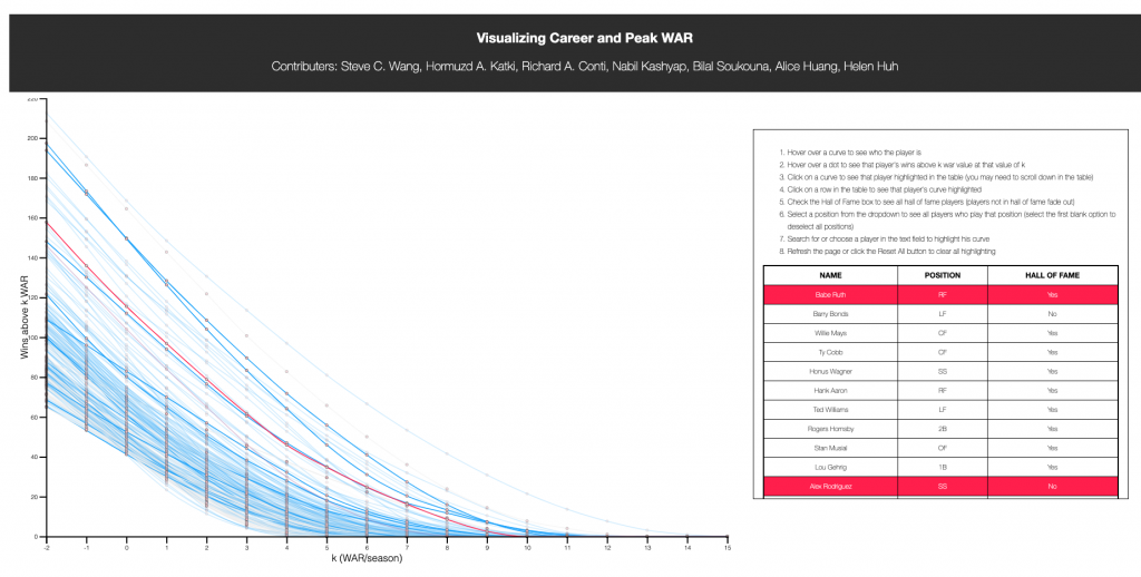
Data visualization is a crucial aspect of modern statistics. Effective visualizations can help people make sense of complex datasets that would otherwise be incomprehensible — a theme that is emphasized in Stat 1, 11, 21, and other courses. Baseball fans often debate whether one player is better than another (e.g., regarding who should be enshrined in the Hall of Fame). A persistent question in such debates is how to weight a player’s peak value — his value at the height of his career — versus his career value — his cumulative value over his entire career. For instance, is a player who is great for only a short peak more or less valuable than a player who is less great but for a longer period of time? Existing methods for evaluating players, which try to sum up a player’s value as a single number, are unable to properly weight peak and career value. Professor Wang developed a new method that visualizes a player’s career as a curve rather than a single number. Each player’s curve shows his peak value at one end, his career value at the other, and a weighted combination of the two in between. This allows us to better evaluate his value. Last fall, Richard Conti ’19 worked with Prof. Wang to write a program to plot these curves. However, plotting a large number of players in a single graph can be difficult to read, as the curves overlap.
This SPEED project created an interactive online graphic to display these curves and allows users to be able to click on a player’s name in a list and see his curve highlighted in the graph, or click on a curve and see the player’s name highlighted. Such a graphic effectively demonstrates the use of visualization to navigate and make sense of complex data, and can serve as an excellent example in applied statistics courses. It could also be a widely-visited resource for baseball fans.
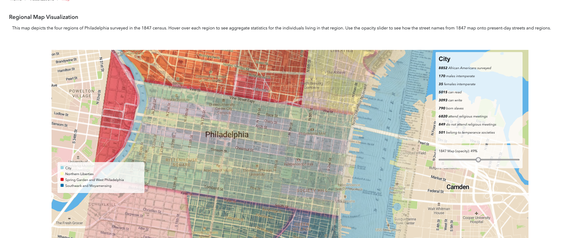
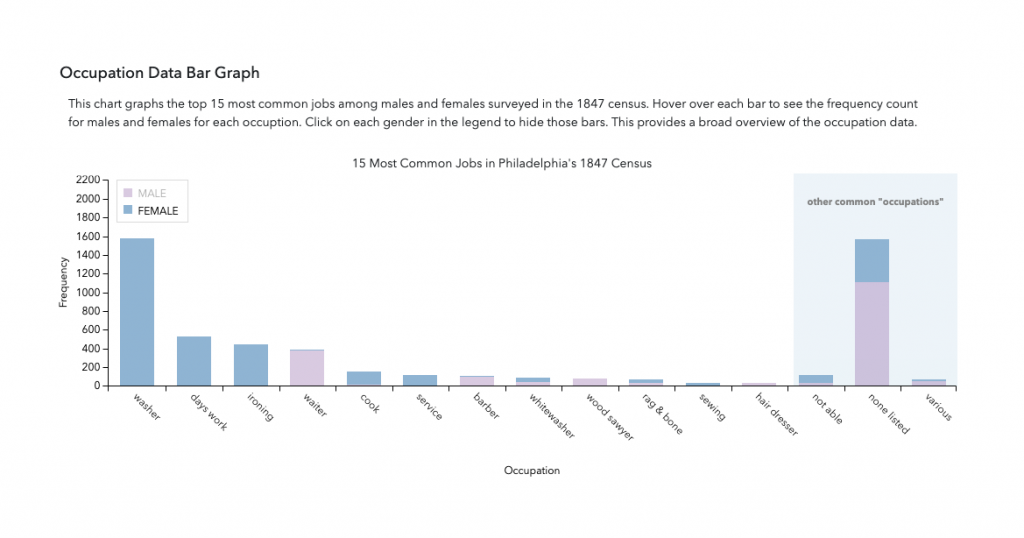
1847 Quaker African-American Census Data Curation and Visualization – Celia Caust-Ellenbogen & Jordan Landes, Friends Historical Library
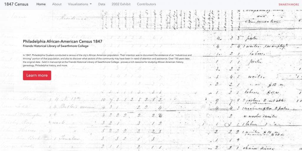
After gaining valuable experience with clean, quantitative data, the SPEED students took on historical data from the Friends Historical Library. They helped Archivist Celia Caust-Ellenbogen and Curator Jordan Landes with a hand tabulated census of African American residents of Philadelphia conducted by Quakers in 1847. They first had to do the unglamorous but important work of transforming the messy, underlying data into publicly available, reusable datasets, an invaluable resource for future researchers in a range of fields. They designed a new site to share and explain the data, updating and making accessible a previous website now over fifteen years old and unusable according to current standards.
Next Year