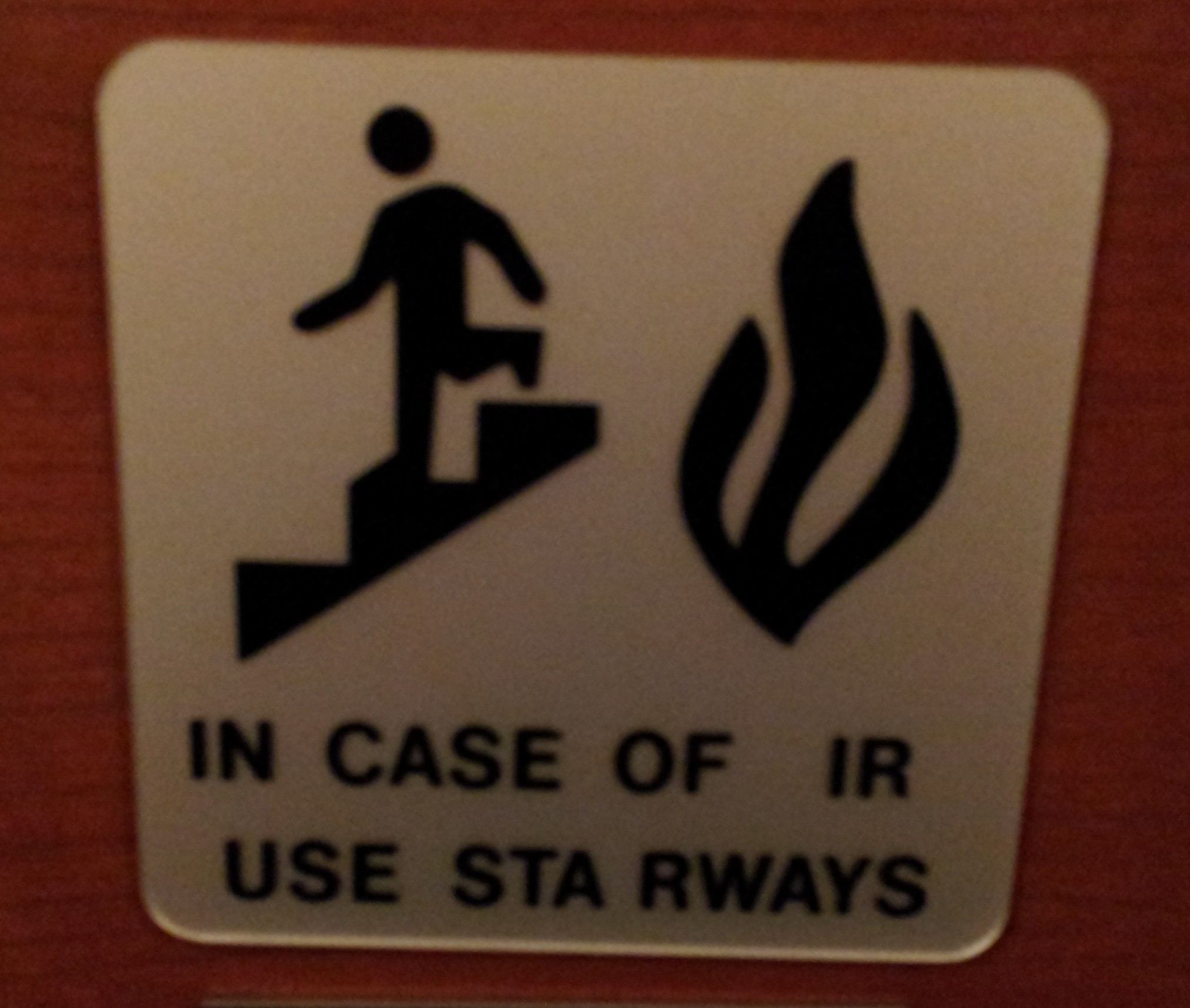
In Case of IR…

[click to enlarge]
I’ve recently been playing around with the ggmap package in R and was able to quickly put together a bubble chart version of student home zip codes. As you can see from the two legends, the size and color both reflect the number of students in these zip codes.
I will certainly be playing around with ggmaps so more as this map required only two lines of code (after the ggmap library was loaded).
R CODE:
usmap<-qmap(‘united states’, zoom=4, source=’osm’,extent=’panel’)
usmap+geom_point(aes(x=X, y=Y, size=COUNT, color=COUNT), data=DATA, alpha=.5)
HAPPY HOLIDAYS!
 Last week I participated in a workshop sponsored jointly by the Center for Digital Storytelling (CDS) and Swarthmore College. It was an intense three-day experience, in which about a dozen participants were taught the basics of constructing an effective narrative using images, music, and voice. The folks from CDS (Andrea Spagat, Lisa Nelson-Haynes) were just wonderful – skilled, patient, experienced – as were our ITS staff members who supported the workshop (Doug Willens, Michael Jones, and Eric Behrens).
I had wanted to learn more about this technology to see if it might be a useful way for IR to share information with the community. I can envision short, focused instructional vignettes, such as tips on constructing surveys, everyday assessment techniques, or even how to interpret a particular factbook table that is vexing. (Generally, a table that requires instructions ought to be thrown out!) We may try one of these and see how it goes.
I learned about the technology, but I also learned some amazing stories about my Swarthmore colleagues who participated with me. These stories often reflect important personal experiences, which could have been difficult to share if it weren’t such a supportive environment. An unexpected outcome of the workshop is that a group of colleagues all got to know each other a lot better!

Institutional research offices are typically known as “clearinghouses” for information on their campuses. Well, this morning I am proud to say that with WolframAlpha’s help, we are able to start tracking yet another important higher ed metric: planes overhead.
If you enter “planes overhead” into the WolframAlpha search box, you will see a listing of planes flying over the location of your IP address.
Searching from my office on campus, I can see 5 planes flying over Swarthmore right now, including a NetJets flight at 15,000 feet. Maybe Roger Federer asked his pilot if he could take a closer look at the Adirondack chair!
You can read more about this feature on WolframAlpha’s Tumblr.

This being the inaugural post for my half of the new blog, I should begin by talking about my approach to blogging. Or at least what I think my approach will be – as you can see from the title of this post and the picture of the cat, I am new to the internet, or at least blogging. Heck, I don’t even “have the facebook”!
My favorite blogs are usually those of the HowTo variety and I often enjoy them most when the blogger is learning the skill alongside/in interaction with the reader. I hope to emulate this style – which shouldn’t be difficult to do since I am hardly an expert in any of the tools that I use.
I should first begin by introducing the tools that I use if I am going to share what I learn/learn from others in this blog:
We use SAS quite a bit in this office. I’ve been told by more than one person that SPSS is pretty much de rigueur in our industry (institutional research), but for me, I prefer something that is a data management program first and a statistics program second. I am also able to produce professional looking tabular output to a spreadsheet or pdf very quickly with SAS by looping through procedures and items with the macro facility. I know this can be done with other tools, R for example, but in my opinion, R does not have the best options as far as producing tabular reports.
Having said that, I do love R and use it quite a bit. I believe that R has many other advantages. For example, we do not have a license to SAS/GRAPH in this office, but even if we did, R still has superior visualization capabilities (IMHO). If you are curious or if you don’t believe me, all you need to do is visit this site. I use the lattice package to create “small multiples” graphs on a regular basis and I plan on doing more visualization stuff with ggplot2. In addition to this, I use R with an ODBC connection to pull data from Banner (an Oracle database) and for other data analysis tasks that would require purchasing an entire additional module in SAS or SPSS – time series or data mining tasks, for example.
This has less to do with any specific piece of software or programming language, but we are also heavily involved in survey research on campus and we are lucky enough to have the web survey tool LimeSurvey (branded SwatSurvey here) available to us. Robin and I have been getting more proficient at using it everyday. But, in general, there is always something new to learn about the design, administration, and analysis of surveys.
So I hope to have more to share (and learn) about these tools in this space soon! And of course I hope to harness the power of the internet hear from others using these or similar tools along the way.