I’ve been working with folks here at Swarthmore to create better conference posters for over 20 years now. There are some new tools available, such as BioRender, which is great for biomedical imagery and also supports poster creation, and some other online tools too numerous to mention here.
Our favorite tool, Adobe InDesign is now available to Swarthmore students, since we’ve been able to license the Adobe CC Suite for student use! We particularly like Adobe InDesign for creating conference posters, because it is one of the best page layout tools out there, and developing skills with InDesign will potentially serve you well into your career in many fields. If you can, avoid presentation software like MS Powerpoint, Apple’s KeyNote, Google Slides or Prezi, etc. They just don’t have the toolset to create great posters.
Getting attention
The fundamental thing that makes a better conference poster isn’t the tools that were used to create it, but the successful effort the presenter went to, to make it attractive and informative. This process starts with re-examining the reasons why you might create a poster. First, while most folks will talk about passing on information, your poster should start by attracting attention! Getting people to come talk with you (and look at your poster)!
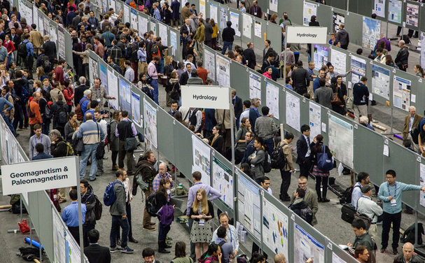
In many conferences, you have thousands of potential audience members confronted with hundreds of posters in a single session (see this conference poster session example from Colin Purrington’s web site). If your poster doesn’t draw folks in, they’ll likely walk on by. And most folks who even go to the poster sessions, do walk past most of the posters. They might stop to chat with folks they know, or check out a few posters that they were intrigued by from the abstracts published ahead of time. But that’s usually just a few posters.
Tell a story
Once you get the attention of your fellow conference attendees, your poster needs to draw them in to talk with you. This is then your opportunity to tell a story about your work. Some scientists don’t like to consider their presentations stories, but that’s just ignoring how we humans best communicate. We like stories. For a research poster, this should be the story of why your work is interesting, what you found, and why it’s interesting and relevant, and what the next steps are (the cliff-hanger).
Thinking about your work as a story helps to conceptually narrow your focus to the elements that are most important; the key points and findings that really bring home your ideas to the viewer. In essence, your poster is the support for the story you are telling as you talk to attendees. It has an arc. It has a beginning or introduction, a middle, where you talk about the research and methods – how you did the work. And then there is the wrap-up, in which you draw conclusions, highlight why the work is so important, and tease the viewer with the coming attractions (what you’re going to do next to answer the questions your work raised).
In many ways, you might consider a poster like a billboard or advertisement for your work – something that draws the viewer in, but that also teases with enough information to make them want to find out more (and thereby, come over and talk with the poster author… you).
Avoid the wall of text
Many have written about painfully text-dense posters. Most folks who start creating posters without really thinking through their goals, put too much text on the page. You’ve seen them at conferences. They are the ones standing alone next to a wall of text, with few graphics.
A poster is not an opportunity to put your written work onto a large sheet of paper! Rather it’s a visual medium. It’s where you can highlight the images and most important findings from your work. The stuff that’s exciting and will bring attention to what you’ve done.
You don’t need, nor do you want, to cover everything you did. Folks who do, usually put up too much text in too small a font size. Save the extra content for your verbal discussions with interested people – you can acknowledge good questions and show how you thought of that too, and how you handled those questions already. And certainly put it into the written paper you have already submitted for publication (you did, right?). But that material shouldn’t be on the poster, because it takes away from the main message.
A few tips
- Bullet points are ok
- Sentence fragments are ok
- Have good, big images
- Avoid tables
- Present your most important data graphically
- Use a large font size that folks can read from 10+ feet away
- Use color to highlight, not overwhelm
- Incorporate white space for clarity
- Make your poster flow visually
- Is your poster is easy to read & follow?
- Test your poster on a large screen (before printing)
- Is your poster accessible?
- Have you linked to further reading? Your contact info? (a QR Code is useful here)
Some good references
Colin Purrington has been writing about and teaching folks how to make good posters both when he was a professor here at Swarthmore, and ever since. Some of the tips I offer here reflect conversations we’ve had about poster design over the years, and are articulated on his web page on poster design which continues to be a great resource for folks creating posters. I particularly like his Do’s and Don’ts, where he has many more!
Similarly, Zen Faulkes book “Better Posters” and Better Posters blog are both informative and fun to read. I continue to take insights from these and other sources in developing my workshops for students and others at the College. Some of the best ways to get better, are to see what others have done, and evaluate how well their posters work, when you go to meetings.
You can also search for conference and scientific posters on Google and Flickr. These sites will let you see poster examples, and help you appreciate what works and what doesn’t. Trust your own perspective. Which posters make you want to find out more? There are lots of good books and articles on presenting data and good design. The Edward Tufte works are but a few examples. Too few poster creators consult these resources.
A new approach?
Relatively recently, in 2019, there has been a bit of a revolution in conference poster design. When he was a graduate student in organizational psychology at Michigan State University, Mike Morrison, posted a video in which he offered an alternative, detailed in Inside Higher Ed, to the wall of text posters so prevalent in scientific conferences and meetings. While he subsequently backed off his extreme initial proposed design with modified versions of his innovative approach, there is still quite a bit of debate about the best approach.
Fundamentally, Morrison’s argument is that the traditional, hard-to-read from any distance wall-of-text poster doesn’t really serve any of the goals of the presenter. I agree. But you do want to be able to engage with the folks who come to a poster session, so you need enough content to support your story. Morrison’s original approach strips too much of the content from the poster. You can use your attention getting poster to make connections with folks who might become better colleagues, or employers, or who might sit on the boards of agencies you are asking for funding. You want them to remember how interesting your work is!
Reflect on your goals
It’s in taking a step back and examining what our poster goals are, that we find our way to better posters. The poster needs to attract the potential viewer to come over and learn more about your work. It needs to have enough information to really get that person to engage with you, the presenter. And it needs to provide the support as you tell the story of your research and work. And when you’re not there, it needs enough content to encourage the viewer to find out more, and to find you and talk with your further. Think of it as a potential job interview, for your next position, or presentation to a funder, or your elevator pitch, if you will, for a venture capitalist! No matter how good your work, your research, it doesn’t matter unless you can communicate it well to others. And if they walk past it, they won’t even get to listen to your story.