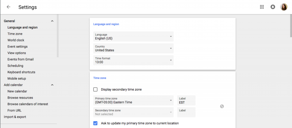
Google is rolling out a new User Interface for Calendar that you will be able to experience here on campus as of November 14th. So what does this mean for your Calendar? It means you are going to get a more streamlined look to your browser-based calendar, plus a few cool new features!
The most noticeable change will be the new look. Google is changing the design of the Calendar to look more like the mobile Calendar apps. It will be cleaner and much easier to quickly scan through. The design is also built to be more responsive to your screen, allowing it to better adapt to various screen sizes and resolutions.

The settings also got a fantastic update, making it much easier to find all of the key features you need for your Calendar. You can also more easily browse and add available Calendar resources, such a department-managed conference rooms.
Popular Labs like Year View, World Clock, and Who is My One-on-One With? have all been folded into the new Calendar as features. No other Labs are currently available at this time.
You can learn more about the new Calendar features on Google’s Official Blog and the Official Google Calendar Help page.

