If you use the Google Suite, you’re no doubt familiar with the daily creep of Gemini and other Google-based AI tools into your documents. In Google Slides, you’re constantly prompted to “beautify” your slide using Nano Banana, Google Gemini’s image-generation tool (indicated by the small banana logo).
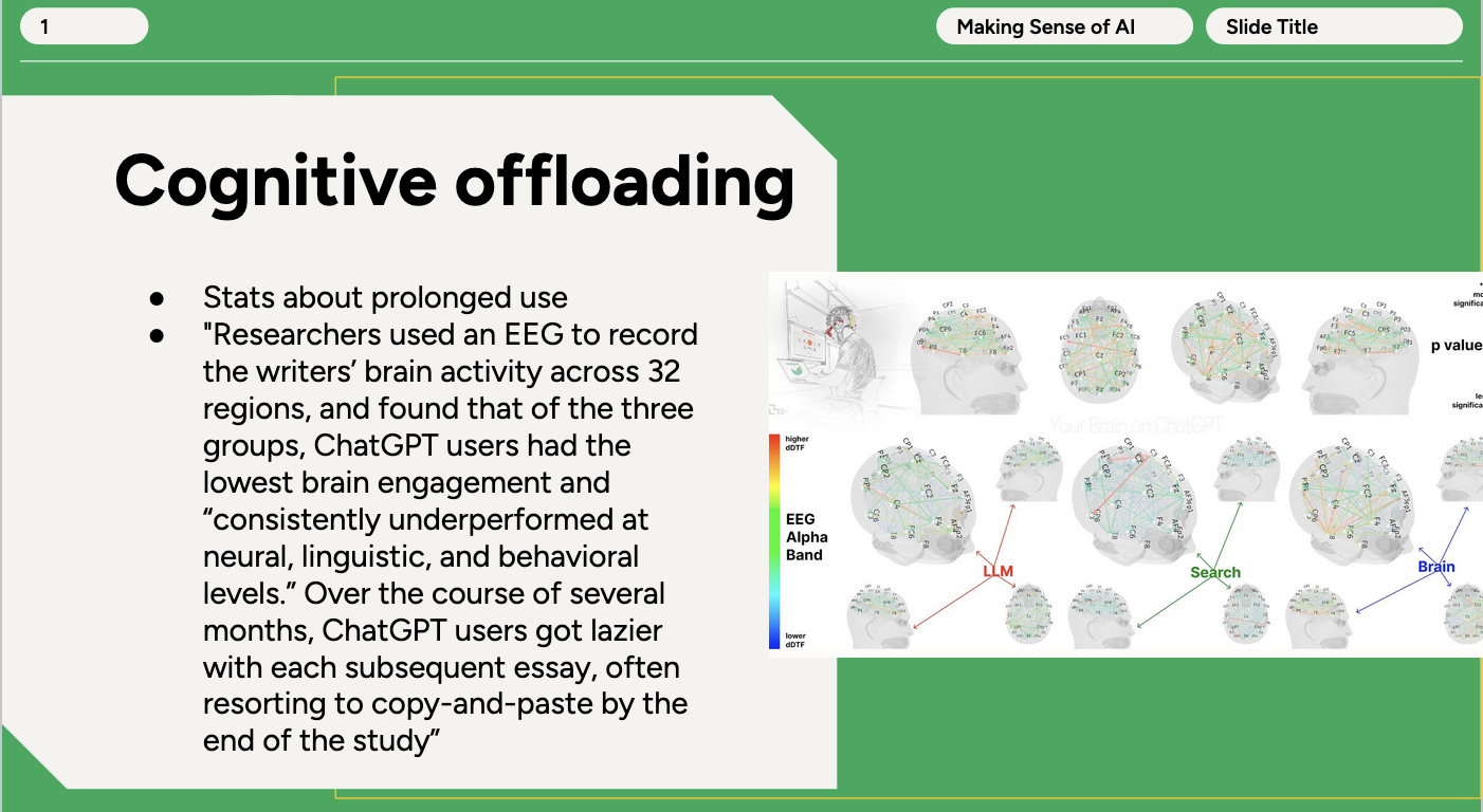
While building a slide deck recently—on the effects of AI overuse, funnily enough—I decided to test it out on the slide below, using the default output with no prompt injection. The results are alarming for many reasons, but most importantly because the “beautify” process strips all of the accessibility features from the slide.
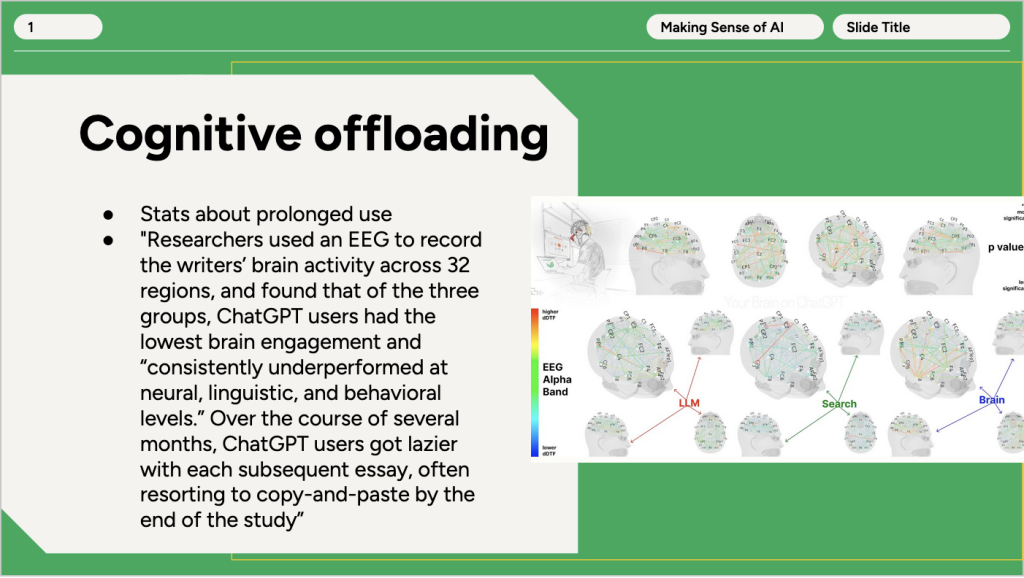
It turns out “beautify” is a bit of a misnomer. It appears to feed the contents of your slide into an image-generation tool with the prompt “Beautify this slide.” It does not generate text boxes or shapes. The final “beautified” slide is a slide-sized image—not an editable slide.
Not only that, the feature rephrased my text, fictionalized brain scan data, and contained spelling errors. The randomly generated brain scans were factually inaccurate and certainly misleading. Furthermore, since the new “slide” was actually an image, I couldn’t alter the text if I wanted to. I couldn’t fix the spelling errors or remove the inaccurate graphic either.
Making the content not editable seemed to destroy the very idea of a slide as a whole. For a bit more control over the slide’s contents, I tried beautifying again with the following prompt:
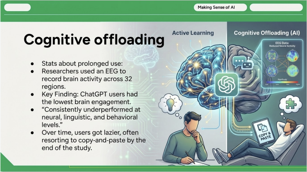
Summarize the key takeaways from text on this slide into three bullet points using scholarly language. Add a border to the image but do not alter its contents. Reformat the slide's design to be easily legible and have a classy, educational designThat got me this image:
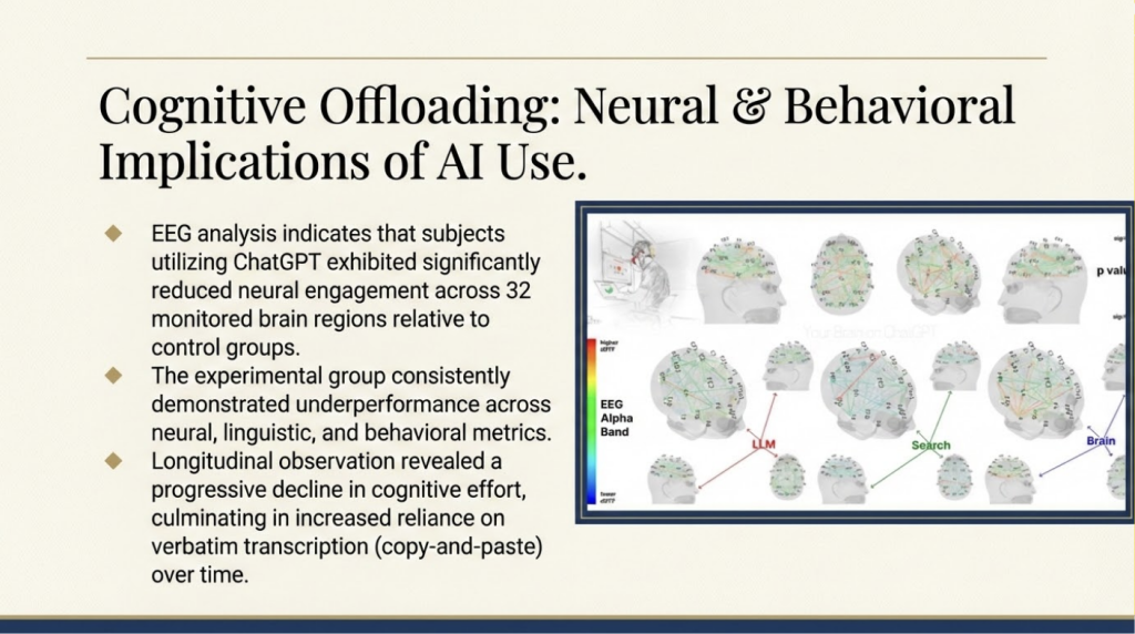
It still suffered from the same drop in quality, most notably in the brain scan image. It originally appeared to leave the image unaltered as I requested, but the drop in quality does make some text functionally illegible. When zooming in to 200% and 400%, I found that much of the image’s text had been garbled into incomprehensible lines as well—so there must have been some alteration.
Some of the “scholarly language” was awkward, such as “The experimental group consistently demonstrated underperformance” instead of “The experimental group underperformed.” The third bullet point particularly was flowery to the point of hurting understanding: cognitive decline “culminating in increased reliance on verbatim transcription” was way more wordy (and hard to follow) than the original “ChatGPT users [were] often resorting to copy-and-paste.” Plus the dense lines of text didn’t seem to help much with the “legible” trait I requested.
Even beyond the language itself being inaccessible to read, this of course renders most screen readers useless as there is no longer text for screen readers to ingest. It also eliminates formatting such as titles, subtitles, and paragraph labels that screen readers and keyboard users rely on to navigate visual material. Despite generating an image, it does not generate accompanying alt text. After beautifying, the alt text was merely populated with the prompt (for the first version, the description was simply “Beautify this slide”). Contrast was low in parts of the first slide and text was extremely dense on the second slide.
When making any slides, we recommend Grackle, an accessibility checker extension that checks for proper structure and image descriptions for screen readers. (Although it should be noted Grackle won’t catch the inaccessibility of beautified slides, because its screen-reading and slide-reading capabilities don’t apply to the image.) If your Google Slides aren’t feeling beautiful, you can try using a beautified slide as inspiration (although you must check the text and images for the insertion of incorrect, misleading, or misinterpreted material). Or you can do what I do: build a deck using one of Google’s premade templates. Always evaluate the accessibility of your tools!