
ITS is ringing in the start of the academic year with a handful of new features and enhancements to The Dash.
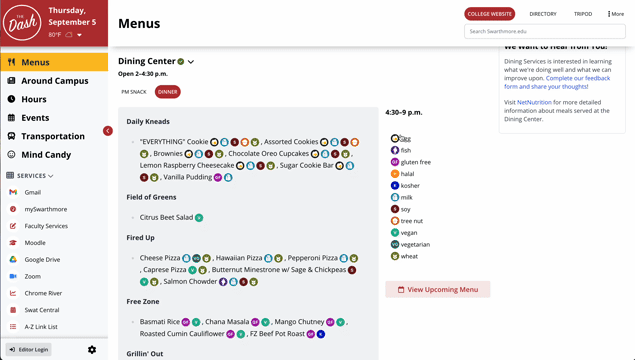
Toggle Dining Labels
Ever wanted to hide one or more of the dining labels that appear alongside menu items? Now you can! Simply click one of the dining labels from the legend to toggle its visibility on the main Dash page as well as the upcoming menus page (swarthmore.edu/menus).
Like with other Dash settings, such as section arrangement/visibility and light/dark mode preferences, these changes are saved across browser sessions until you clear your cache.
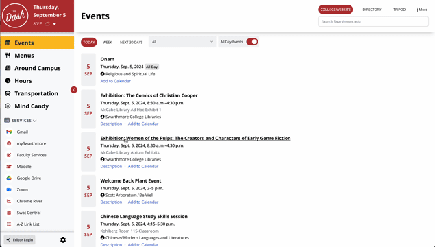
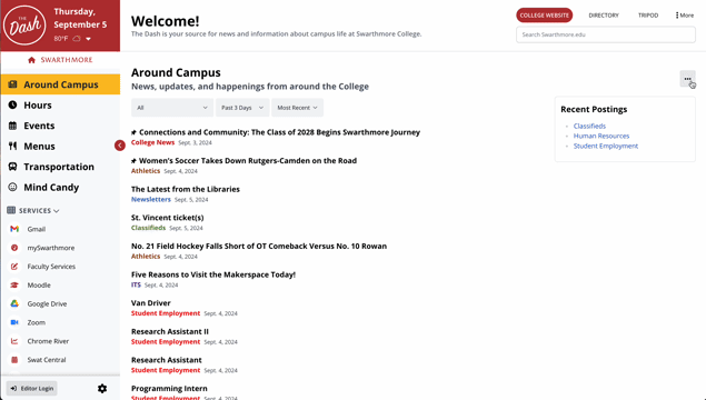
Updates to the Around Campus and Event Sections
We’ve made it easier to learn more about an event or news item without having to click the link to open it in a new tab. You can toggle short descriptions for Around Campus news items from the settings in the upper right-hand of the section (they are turned off by default), and you can view additional details about individual events in the Events section by simply clicking the “Description” link at the bottom of an entry. Additionally, you can add any event to your preferred calendar software using the “Add to Calendar” link at the bottom of the event.
Section Settings Moved to Drop-down Menus
Some sections of The Dash have settings that allow you to hide or display information, like the filters for Events or the descriptions for the Around Campus news stories. This should hopefully make it easier to interact with each section’s unique settings without cluttering up your screen. These section-specific settings, as well as the familiar “Hide Section” button, are now available from the “three dots” drop-down at the top of each section.

SEPTA Train Numbers Link to Real-Time Maps
For staff and students who regularly use SEPTA to get to and from Philly, we’ve added train numbers so that you can easily keep tabs on where your train is using SEPTA’s real-time maps. Simply click the train number to the left of the arrival time to open a map showing your train (if departed) in a new window.

Visual Improvements and Other Updates
While not particularly flashy, we made a bunch of visual tweaks to increase readability, functionality, and ease of use. For instance, we removed the lightly used card/list view toggle for the Around Campus and Events sections, updated the icon set that’s used across the Dash, and fine-tuned the use of color and shadow in various sections, among many other smaller changes.
While we’re excited to share the latest Dash updates, don’t forget about the customization options that were already available, such as the ability to rearrange and hide sections, pick between light/dark mode, and more.