 Link to Summer research resources

 Sticky post
ITS Insider February 2026
February’s newsletter includes articles on classroom displays, minimum DUO Mobile app requirements, presentation design tools, using Google Docs to draft emails, using a cell phone security lanyard when traveling, and the spring ITS Lunch & Learn Series. Continue reading ITS Insider February 2026
 Sticky post
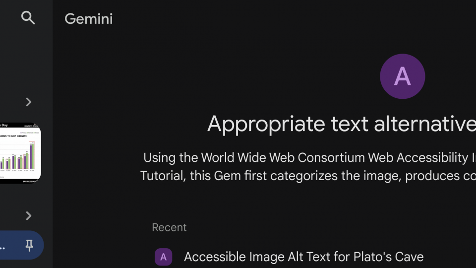
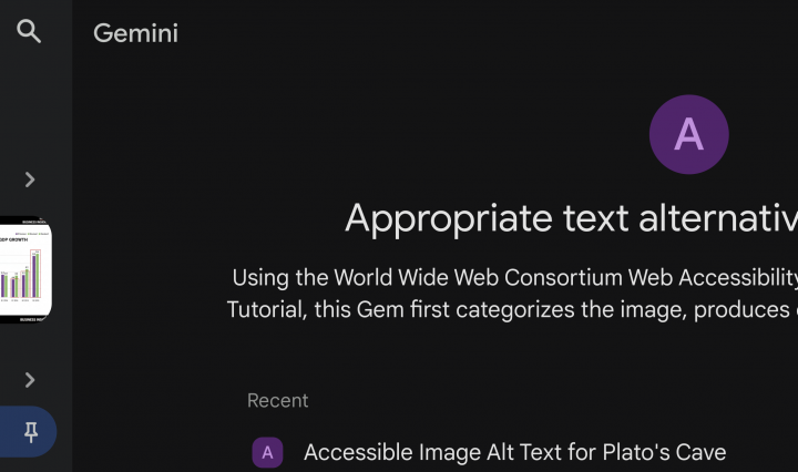
Using AI, you, too, can create better alt text!
Up until late last semester, one of our Artificial Intelligence (AI) subscription services—Gemini—didn’t allow us to share the bots we create. Gemini calls these “Gems”. With the Appropriate text alternatives for images Gem we created using AI, you, too, can … Continue reading Using AI, you, too, can create better alt text!
 Sticky post
Tired of Email? Subscription Options in Google Groups
Are you tired of email? Do you find yourself overwhelmed by the sheer volume of official messages? Navigating listservs at Swarthmore can often feel confusing. Good news! Swarthmore’s Accessibility Working Group identified communication as one of our improvement goals for … Continue reading Tired of Email? Subscription Options in Google Groups
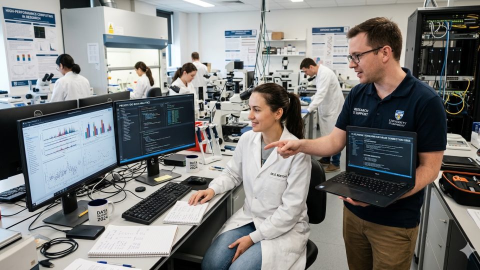
Summer research resources
Even though it’s just February, this is a great time to think about your summer research plans! Whether you are working with a Swarthmore College faculty member, or you are a faculty member who’s recruiting summer students, now is ideal … Continue reading Summer research resources
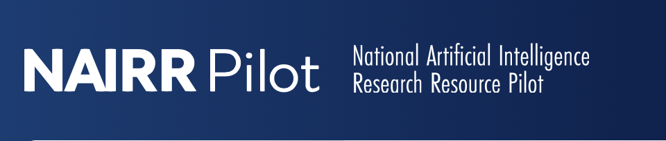
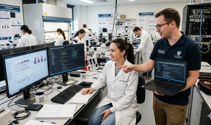
NAIRR Pilot
The National Artificial Intelligence Research Resource (NAIRR) Pilot program “aims to connect U.S. researchers and educators to computational, data, and training resources needed to advance AI research and research that employs AI.” With the dramatic increase in recent years in … Continue reading NAIRR Pilot
Who’s Auditing? Moodle Now Knows
ITS has introduced a new Moodle feature that assigns students and community members who are auditing a course the Auditor role. This role does not include a gradebook entry, making it easier for instructors to quickly distinguish between students taking … Continue reading Who’s Auditing? Moodle Now Knows
ITS Insider January 2026
January’s newsletter answers the question, “To update or not to update” (Windows OS)?, Is it “Greenlight, go!” (for Tahoe) and how to update macOS without upgrading, Microlearning with LinkedIn Learning, adding a temp Zoom phone voicemail greeting via holiday hours, turning your smartphone into a webcam, and the spring ITS Lunch & Learn Series. The ITS Insider is the Help Desk newsletter which includes timely topics and events. Continue reading ITS Insider January 2026